Tag Archives: notebook review

Clairefontaine Graf It Pad 90g

9 Sep

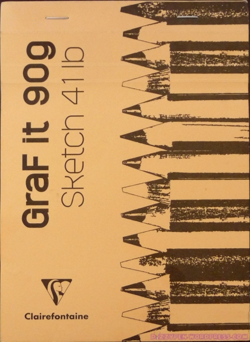
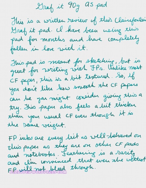
This is going to be a handwritten review of the 90g Clairefontaine Graf It Pad. This is one of my favorite papers for writing down quick notes, lists, etc. As you can tell by the cover and the name, this pad is intended for sketching, but I find it works very well as paper for fountain pens. I am not an artist, so you won’t see any sketches here, but I hope you find this review useful nonetheless.

The Details:

  • Pad is staple bound at the top.
  • Cover is made of card stock. Front is flexible and the back is stiffened by a piece of backer board.
  • Sheets are perforated for ease of tearing.
  • Pad opens flat, but it can be difficult to write on the back of the sheet.
  • Graf It paper is 90g and slightly off white.
  • Unlike other CF papers this has a light texture to it.
  • Takes fountain pen ink well with no feathering or bleeding.


(click to enlarge and sharpen the images)

I apologize for the ink color in these scans. I could not get the colors to show up any more accurately than this. The Levenger True Teal was a vibrancy to it that the scan has completely flattened.

I won this notepad in a Goulet Pens giveaway many months ago. I am not affiliated with them or Clairefontaine.

teNeues Famous Faces, Che Large notebook

5 Oct

(click to enlarge and sharpen the photos)

Appearance / Design

From the moment I saw this journal in the teNeues catalog I knew I had to have it. The cover art was awesome! However, once I received it, I was put off by all the text on the back cover and end papers. I prefer my journals to be relatively clear of that sort of thing. This is an otherwise fairly attractive journal. There is a sturday elastic closure and back pocket.

There is also a Bookmark with the teNeues name written down it several times. I’m also not a fan of that. The spine of this journal is more like the spine of a novel.

There is a small picture of the cover art followed by “Famous Faces” and “teNeues.” There is a very sturdy pen loop on the edge. As you can see from the photos, it easily accommodates a Lamy Vista.

Construction/Dimensions

This book is roughly 6 1/4″ by 8 5/8″ and roughly 5/8″ thick. It’s an overall appealing size. This journal’s sturdy binding is not unlike a hardcover book. The cover is that same sort of coated slick film over stiff backer board you would find with a hardcover book. Though it’s all very durable, it’s not what I normally look for in a journal. Still, there is something about it that I quite like.

Probably one of my favorite things about this journal is that it lays flat! Gotta love that.

Paper

Now for the moment of truth… surprisingly enough this paper is fairly fountain pen friendly. According to the folks at teNeues, the paper is 100g Taiwanese Creamy Woodfree paper. It is not recycled or specially certified like you’d find with Rhodia, Clairefontaine, etc.  The pages are off-white with faint gray ruling. As you can see, the ruling is rather wide at 10mm. Unfortunately, this is the only ruling available. It is far too wide in my opinion. I much prefer ruling of about 6mm. You’d be able to get more words on the page that way.

Many of the inks I tried took to the paper well. Feathering was a bit of an issue with the wetter nibs as you can see above, though I did not have any problems with bleed through. You can write on both sides of the page with very minimal show through.

Cost and Conclusion, (8.5/10, B+)

I asked the folks at teNeues about the availability of the Famous Faces collection and here is the response, “The run is not limited for the moment and we will continue to reprint these journals probably for the next two years. We will also add four more journals (two small, two large) to the line in the next year.”

The journal will run you an affordable $12.95 at the teNeues website. With that kind of price, it is hard not to be tempted. However, if the folks at teNeues want to break into the fine writing (fountain pen oriented) market they need to make a few changes: Firstly and more importantly, they have to use paper that is consisent in quality and resistant to feathering, bleed through, and show through. Secondly, they need to offer options for page formats from a narrower ruling to a grid or dot ruling to offering blank pages. Third, they need to streamline their journals. Less is more when it come to fine writing stationery. Fountain pen users on the whole, do not want journals that are covered with branding, writing, histories of the company, etc. In general, we’d prefer to have that sort of information available to us on the company website or removable packaging materials of one kind or another.

Nevertheless, this is a decent journal at a low price. If you are ok with some minimal feathering and if you like funky cover art the teNeues Famous Faces collection might be up your alley.

This journal was sent to me for review by the good folks at teNeues. I am not otherwise affiliated with them.

Rhodia Webnotebook 3.0 Review and GIVEAWAY!

31 Aug

If you’ve been a part of the fountain pen community for any length of time you’ve no doubt heard of or seen Rhodia products. For that matter you’ve probably heard of Exaclair and two mysterious ladies, Karen Doherty and Stephanie (BiffyBeans). They are those rare sorts of folks who make sure that the products they distribute live up to user expectations/requirements.

Anything we (the fountain pen community) clamor for we get (within reason). We want J. Herbin ink in 100 ml bottles? SHAZZAM! They appear. We want a fountain pen friendly bound high quality journal? Karen and co. wave their magic wands and VOILA! We have the Rhodia Webnotebook (affectionately dubbed the Webbie). Then we, in our ever demanding fashion, whine for Webnotebooks that lay flatter, have 90 grams paper (worldwide), and are sans the Rhodia logo on every page and KABOOM! Enter Version 3.0 of the Webnotebook!

Version 3.0 is just about everything we have been asking for. The paper is fantastic. The quality of the construction is noteworthy. The appearance screams class and refinement. The current iteration of the Webnotebook is truly perfect for the fountain pen user. And guess what? If you don’t like the ivory paper of the Rhodia Webnotebook there is always its sister from another mister, the Quo Vadis Habana. <–Exaclair strikes again!

From all the gushing, I assume you’ve realized that I quite simple ADORE Rhodia Webnotebooks! But, gushing aside, let me get down to the nitty gritty of it all. Below you will find a scan of the handwritten review for the Webbie 3.0 .

Here are the basics:

  • It comes with 96 pages of 90gsm Ivory paper that is smooth and very resistant to bleeding and feathering. There is a little show through, but not enough to fuss over.
  • You can have your Webbie 3.0 with lined pages or blank pages, with a black or an orange cover, and in a large and small size.
  • The journal is very well constructed. It comes with an elastic closure, bookmark and rear pocket for convenience.
  • It costs anywhere from $18 to $22, which puts it in line with the Moleskine, but this has much MUCH better paper.

(Click to enlarge and sharpen the photos)


The full review


Writing samples


Front Cover


Thickness


Lay Flat


Back Pocket

DO YOU WANT A FREE RHODIA WEBNOTEBOOK?!

I received the above journal as a sample for review, but when Exaclair sent the sample they sent two, so I’d have one to giveaway to my readers. Sooooooo, don’t just take my word for how great these notebooks are, try one for yourself!

Here’s what you need to know:

  1. Click here and fill out the form
  2. You must enter by 11:59pm EST on Tuesday, September 7, 2010.
  3. The winner will be chosen by Random.org
  4. I’ll let you know who’s the lucky winner on Wednesday, September 8.

I received these two Webbies as samples from Exaclair. I am not otherwise affiliated with them.

Exacompta Basics Gold Edged Sketchbook with Madeira Cover

23 Oct

exacompta cover

I was in the market for a new journal when I sent a question to Karen at Exaclair about one of their other Exacompta blank journals. She informed me that it was not very fountain pen friendly and suggested that I might like the Basics journal. Within a couple days of that conversation I received the journal reviewed here as a sample. Thank you so much for the excellent customer service! (I am not otherwise affiliated with Exaclair. My apologies for the quality of the photos. The light is not very good today.)

First Impressions:

Upon receiving this journal I was immediately impressed by the quality and vibrancy of this journal’s cover. I just looked at it and handled it for a couple minutes before even opening it up. Then, when I opened it up, I was again impressed by the high quality of the paper.

Appearance:

exacompta cover close up

The journal I received has the red Madeira cover. "Sketch Book" is conspicuously impressed on the front of the cover. This cover can also come with "Journal" impressed on the front rather than "Sketch Book." I’d much prefer one that said "Journal" since that is what I will use this for, but either way, I’d just like it to be plain. As a general rule, I do not like embossed or impressed leather or leather-like covers. I always feel it takes away from the appearance of the journal unless it is a discreet personalization. YMMV

The cover is not leather, but it sure feels like it. Faux leathers usually feel cheap to me, but Exacompta has gotten this one right. It’s is soft, supple, and smooth with just a bit of light texturing. The stitching on the cover is also quite excellent. It is obvious that some serious thought went into the design of this cover. Very well done.

exacompta profile

This journal is gold edged, but I also understand that it comes with silver edging if you’d prefer that. I’m not so fond of the gold edging though it does add to the "up-market" feel of this journal.

Construction/Dimensions/Design:

exacompta open

The Basics Journal is the perfect size: 8" in length, 6" in width, and 1" in depth. AND, it lies flat! This is invaluable!

The excellent quality of this journal continue on the inside. The pages are stitch bound and taped. There is a very functional tri-colored bookmark. The end papers aren’t very stiff but certainly do their job. My only quibble is that they are printed all over with the Exacompta logo. It takes away from the overall feel of this journal YMMV.

exacomta refill

Of course the cover is refillable. The refills are called Exacompta Basics Sketch Book or Journal. You have the choice of lined or blank pages. I prefer blank. You can use the refills without the Madeira covers and save yourself a few bucks. The refills offer a simple tan or black cover stamped with a small picture and the words "Journal" or "Sketch Book." As I mentioned earlier, you also have the choice of either gold edging or silver edging.

Paper:

exacompta paper

This is the most important part for me. The paper in this journal is superb! The Basics journal contains 100 g, off-white, 25% cotton content laid paper. The paper takes fountain pen ink exceedingly well. There is no bleed through, no feathering, and show through is nearly non-existent. This paper is just about perfect. It reminds me of G. Lalo Verge de France .

exacompta writing

Now some people have issues with laid paper. They feel as though their nibs get "catch" on the texture. I do not have this issue even with my extra fine nibs. YMMV.

Cost:

The Writer’s Bloc has these listed at $20 regular price. The refill by itself runs $11.40 for either the lined or the blank pages. I think this is an excellent price for what you get.

Conclusion, A-/B+:

I really like the Basics Journal. It is very well made. The cover is excellent, the size is ideal, it lies flat, and the off-white laid paper is a dream to write on. I only have a couple quibbles: I don’t care for the "Sketch Book" impressed on the cover and I’m not fond of the gold edging.

I would definitely recommend the Basics Journal (with or without the Madeira cover) to anyone who is looking for quality, function, and affordability.

Thanks again Karen!

Equology by Quo Vadis Sapa X 2010 Weekly Planner

22 Oct

SapaX cover

Up for review today is the Equology by Quo Vadis Sapa X Weekly Planner for 2010. This is a pocket planner designed for minimal environmental impact. I received this planner as a sample from Exaclair, Inc. Thanks!  (I am not otherwise affiliated with Exaclair)

First Impressions:

This little planner just looks and feels great. It’s the perfect size for slipping into a pocket, purse, or bag.

Appearance:

sapax cover2

The cover is an attractive clay sort of red-brown. According to the label, it’s made of 83% recycled materials it feels great in hand, but the feel is kind of hard to describe. The material feels like it’s some sort of rubber or vinyl, but it still feels soft to the touch; it is very reminiscent of leather. On the top right corner of the cover appears the Equology logo and on the bottom right corner is the Quo Vadis logo. The pages are printed in grey and teal. This is a fantastic color palette.

Construction/ Dimensions/ Design:

As one would expect from Quo Vadis, this planner seems quite sturdy and durable. The binding is sown. There aren’t any heavy end papers. There is just an addition page of the same paper used throughout the planner that is partially glued to the paper cover of the planner insert.  The size of this journal is perfect for carrying: 5.5″ in length, 3.75″ in width, and .5″ in depth. Very compact. It’s also fairly light. It lays flat fairly well. It will stay open to the page I’ve turned it to.

The planner begins with the coversheet, a page for personal information, and a 2010 calendar with weeks beginning on Monday. After this comes the actual planning section.

sapa x planner

As you can see in the photo, this planner is laid out with a week on two pages: Mon-Wed on page 1 and Thurs-Sun on Page 2. Each day gives you about 1.25″ of space to write the day’s appointments. Each day section also has hours of the day listed on either side of the page so that you can write in appointments: 8am-1pm on the left and 2pm to 7pm on the right. The month is written at the top center of each page, a calendar of the current month appears on the bottom right corner of page 1, and “Quo Vadis” is very discreetly printed on the bottom left corner of page two.

sapax notes

At the end of each month’s worth of planner pages are two blank pages for notes. The planner ends with a section of maps, a phone book, and a 2011 calendar.

And of course each page has a tear away corner that is very functional for keeping your place in the planner. This is one of my favorite design features.

I own one other Quo Vadis planner, the Septanote, and one of their strengths is their functional and practical designs. This format is quite practical, although I have one quibble. The times that appear on the outer edges of each day section are just not functional for me. There isn’t enough space to really use the times unless you have very small writing. I’ll likely just write down my appointment and notes as if these times were not present.

Paper:

sapax writing sample

Now, this is perhaps the most important aspect for us fountain pen users. This paper is off-white leaning toward grey which I love. It’s also 100% recycled and seems to be about 64g in weight. It is not the most fountain pen friendly paper combination. Most us know to be very wary of any paper that says 100% recycled. This usually means the paper will bleed and feather like crazy. HOWEVER, I have to tell you this paper was not terrible.

sapax bleeding

Bleeding and show through are an issue, but feathering is not. One thing that seems to work well to control the bleeding is to write with your nib upside down or use fine or extra fine nibs. When I do that I don’t get bleeding.

All other writing instruments perform quite well on this paper. I tested a gel pen, roll ball, ball point, felt tip and pencil. While there was some show through there was no bleeding and the show through was not bad enough to impede use of the planner.

Cost: The Writer’s Bloc has this planner priced at $16.25 which is pricey, as one might expect for a higher end planner.

Conclusion:

I generally like this pocket planner and I will carry it around with me, but I really wish this planner had better paper: like the Clairefontaine 90g paper. Yes, I know it would increase the weight and thickness of this pocket planner, but I and probably most other fountain pen users, would accept those side effects so long as it meant a pocket-sized planner that was completely fountain pen friendly! Now THAT would be a planner I’d really ENJOY carrying and using everyday!

As is, this makes a great pocket planner for any gel pen, roller ball, ball point, or pencil users out there. And, a fairly decent one for fine nibbed fountain pens.

Paperchase Flexi Notebook, A6 “Lisa Floral”

16 Oct

PC Flexi Cover

Up for review today is a Paperchase journal. This is the lined A6 (roughly 5×6.5) Flexi Notebook. I use this little guy as my daily journal. I’ve been using it yearly everyday since August.

First Impressions

Well, I went to Borders looking for an interesting journal that I could use for my everyday journaling. My Borders has a particularly large selection of Paperchase products, but not much else. I picked this one because it was on sale not because I was drawn to it.

Appearance

The cover is an attractive cloth cover. There are lots of different covers and sizes available. This one is a floral pattern, but there are some with geometric shapes, polka dots, birds, etc. For those interested in something more simple, there is also a black cover and I think a couple other solid color variants.

Construction / Dimensions

PC Flexi Height

As stated the journal is A6 so it’s about 5 x 6.5. It is a thick little notebook at about 7/8" thick. This journal is very well made. The spine of this journal is rounded. The signatures are sown and glued. The end papers are a very sturdy cardstock in a coordinating color (navy blue for mine). The cover is flexible which might be an issue for some. It’s annoying at times, but generally not too big a problem. The cover is also well attached. This journal has a very solid and tight feel to it. Now there are a few issues. The biggest issue for me is that this journal does not lay flat EVER. You have to hold it down which can be a pain in the butt. The other issue has to do with the corners. This journal’s corners are at 90° angles. Thus, they are prone to getting beat up and bent up with wear. Also, since the cover is cloth, there is a strong possibility that the fabric will rip at the corners. Mine is already showing some rubbing at the corners. Now, this is not a big issue for me because my journal usually stays by my bed. But, if you carry yours around you might want to keep this in mind.

PC Flexi Open

PC Flexi Spine

Paper Quality

PC Flexi Close Up

I have an email out to Paperchase for information about the weight, composition, and place of manufacture for the paper. Once I have a response I will update this review. What I can say now is that the paper is VERY fountain pen friendly. This is by far the best aspect of this journal. I haven’t had any issues with feathering, bleeding, or even show through. Amazon says this is 100g paper and i can believe it. This paper is pretty thick. It easily takes every my wettest nibs with no problems at all. (The notable exception to this is ND Polar Blue, but that is to be expected. I haven’t met a paper yet that can hold that one.) The paper is smooth, but not as smooth as something like Clairefontaine. My nibs perform flawlessly on this paper. No noticeable drag or tooth. This journal is lined although I did see an unlined version in a smaller size. The rule is pretty wide at 5/16 inches. The lines are a light grey. I don’t normally like lines, but these are not intrusive.

PC Flexi Inks

Cost

Paperchase is a UK based company. They retail these journals through Borders. The retail cost is $12.99, but I was able to get this journal on sale for $6. Considering the fact that this is an imported product, this price seems pretty fair though I’d advocate getting it on sale rather than paying full price.

Conclusion (8/10, B/B+)

I really like this journal. The paper is excellent. I’ve run many of my inks through it without problems. Even still, I’m not sure I’ll buy one of these again. The fact that the journal does not lay flat is a PIA. If you can get over that you’d probably love this journal.

PC Flexi Length

No Affil.