Tag Archives: Blue/Blue-Green/Turquoise

Diamine Sapphire Blue

12 Aug

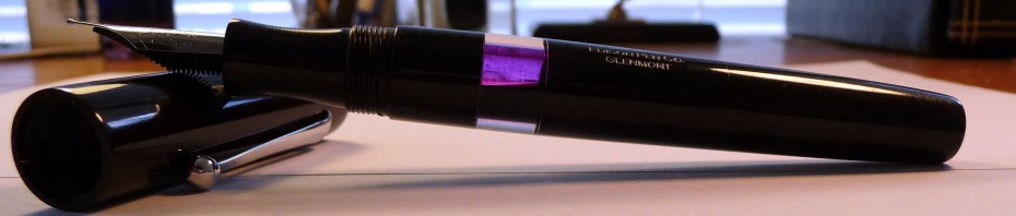
This is an oft recommended ink, and I can understand why. It is  a very standard looking medium blue with a hint of purple. There are other similar colors such as Waterman Florida Blue, J. Herbin Eclat de Saphir and Quink Washable Blue. But, what this ink has that those don’t is higher saturation. That fact makes this my favorite purplish blue ink of the bunch.

The Details:

  • No feathering or bleeding.
  • Great flow and lubrication
  • Average drying time
  • No shading
  • Surprisingly water-resistant

Now, last week I reviewed Noodler’s Baystate Blue. In my opinion, this is the closest BSB sub that I have seen. Of course it isn’t perfect. When you are trying to come up with BSB subs there are certain concessions that must be made. Firstly, you aren’t going to be able to get that trademark vibrancy that BSB is known for. There really aren’t any other inks on the market that will glow like BSB, so if that is the most important characteristic to you, then you might as well stick with BSB. Secondly, you aren’t going to get the same level of waterproofness from any sub. You can get some water resistance, but not 100% waterproofness.

In my opinion, Sapphire Blue is  a very similar blue with a bit more purple thanBSB. It is not as vibrant, but it still jumps off the page. It is almost as saturated. It has a pretty high level of water-resistance.

This sample was sent to me by the good folks at Diamine. I am not otherwise affiliated with them.

Swabs of New Platinum Mix Free Inks

1 Aug

(click to enlarge and sharpen the image)

I just received my 9 super samples of the new Platinum Mix Free line. I thought you all might want to see the swabs. I haven’t played around with the inks yet, but I will definitely put up some reviews as soon as I have formed opinions of them.

Initial Thoughts:

  • Smoke Black is a rather average black.
  • Earth Brown is a reddish-brown. It is very similar to J. Herbin Cafe des Iles.
  • Aurora Blue is one of my favorite. It is very similar to Diamine Sapphire Blue.
  • Aqua Blue is a nice turquoise blue. It is very similar to J. Herbin Blue Prevenche.
  • Leaf Green is also a nice green color. It reminds me a bit of J. Herbin Lierre Sauvage.
  • Silky Purple is definitely my favorite color of all these, and it is nearly identical to J. Herbin Rose Cyclamen. It’s very bright and a very red purple.
  • Cyclamen Pink is nearly identical to the long since discontinued Levenger Pinkly.
  • Flame Red is nearly identical to Noodler’s Dragon’s Napalm.
  • Sunny Yellow is a fantastically rich yellow.

Sample Kit retailers:

  • ISellPens.com sells a sampler for $20. In their kit you get a 10ml sample of each 9 colors of Mix Free inks, 2 extra bottles, and 2 ink syringes. This is where I purchased my kit.
  • GouletPens.com sells a sampler for $30. In their kit you get a 5ml sample of each of the 9 Platinum Mix-Free fountain pen ink colors in labeled plastic vials, a Goulet ink syringe set, and ten empty ink vials.
  • PearTreePens.com sells a sampler for $29.95. In their kit you get one 5mL sample of each of the 9 specially designed colors, one Write-Fill Kit, an empty full-sized ink bottle (of their choice), and three empty sample bottles.

There are several places you can get full bottles of Platinum Mix Free inks. Individual bottles are around $20 each. Many places are selling full-sized sets of all 9 inks for $149.

Happy mixing!

No Affil.

Noodler’s Baystate Blue

25 Jul

Few inks inspire the kind of intense emotion that this ink does. You either love it or hate it, and each camp is very vocal about its opinion. FPN has recently attempted to curtail discussions of this ink because of the kind of vitriol that it inspires. Kinda crazy, huh?

These intense emotions all come from stories (some true and some not) that BSB (as it is called) destroys pens. This, in my opinion, is silly. Basically, there was a run of Lamy feeds that were made from a ‘defective’ plastic. That plastic became very brittle/melted when it came into contact with BSB and some other inks. That material has since been replaced, but the legend lives on. Every once in a while someone will get a hold to a new old stock Lamy Safari and resurrect the whole business.

BSB is a high maintenance ink to be sure. IT DOES NOT LIKE OTHER INKS. Even trace amount of other inks can cause it to turn into goo/throw off percipients that, once dried, can severely clog a pen. So, if you are going to use this ink, your pen should either be unused or 100% cleaned of all other inks.

For more info on how to safely use BSB, and tips for dealing with some of its quirks click here.

OK, honestly, I had no intention of trying this ink. It’s not necessarily a color I’d use often, and I didn’t really have a good pen to use it in. Well, when a sample of it came in one of my Ink Drop packages, I figured I might as well see what all the fuss is about.

It’s a nice blue violet sort of ink*. Its main draw is its intense vibrancy*. Honestly, it is too bright for me. In fact, it is so bright that it gives me a headache. Still, some folks absolutely swear by it and use it for everything. It’s a nice ink, it’s just not for me.

I didn’t have any clogging issues. There was some staining to the feed and the barrel, but it came right off with a little diluted bleach and soapy water. The Dollar pen was no worse for wear. (I am not recommending that you bleach your pens. I have no idea how your pens will react. Bleach your pens at your own risk!)

The Details:

  • It feathers and bleeds a bit depending on the paper
  • Great flow and lubrication
  • Fast drying time
  • Some good shading depending on the pen/paper combo
  • Waterproof

It is hard to capture the neon quality of this ink. I’ve done my best. (Click to sharpen and enlarge the images)


* I’ve noticed that overtime my writing samples are changing color to a rather average (and not neon) medium dark blue.

No Affil.

Rohrer & Klingner Blu Mare

14 Oct

This is a nice enough turquoise blue. I was hoping for something with a bit of green in it, but this isn’t at. This ink is bright and well behaved. In that way, it reminds me more of the turquoises of old:  Skrip Peacock Blue/Turquoise, Pelikan Turquoise, Mont Blanc Turquoise, etc.

If you are looking for a straight turquoise blue that exhibits wonderful behavior this may just be your ink.

The Details

  • No feathering or bleeding
  • Good flow and lubrication
  • Saturation is average (think Herbin)
  • Drying time is reasonable at 5 seconds on this card and 7 seconds on HP LaserJet 24#
  • Minimal shading
  • Not even slightly water resistant let alone waterproof

(Click to enlarge and sharpen the image)

This sample was sent to me for review by Ryan at PTP. I am not otherwise affiliated with them.

Pelikan Edelstein Sapphire

8 Oct

In this month’s Ink Drop, I received a sample of Edelstein Sapphire. I wasn’t very excellent to receive it. I’d been hoping to see a color that was a deeper Sapphire not unlike the old Parker Penman Sapphire. Edelstein is not it. Instead, this is a Sapphire not unlike all other sapphire inks on the market. It’s a purple-blue that looks more like a periwinkle flower than a gemstone.

Still, this color category is appealing to some. To be quite honest, it’s one I don’t mind. I have a couple bottles of J. Herbin Eclat de Saphir and a bottle of Diamine Sapphire for instance. I think the real problem here is the price. Yes, I know Edelstein is packaged in a very expensive looking bottle, but I don’t write with the bottle. I write with the pen! At least Pilot Iroshizuku, for its outrageous price tag, offers inks that are unique in both color and behavioral characteristics.

The Edelstein Sapphire ink ($20) is nice. It flows well and all that, but it really isn’t any nicer than J. Herbin ($9-$10) or Diamine ($12). In short, while it’s nice, it’s not nice enough to pay for the packaging. After all, I don’t keep my inks out on my desk. Direct sunlight is not good for them. It’d just be a pretty bottle sitting in its box, within another box, and up on the shelf. You see where I’m going here?

The Details

  • No feathering or bleeding
  • Great flow and good lubrication
  • Saturation is low to average just like J. Herbin
  • Surprisingly slow drying time at 15 seconds on this card and HP LaserJet 24# paper
  • Minimal shading, but certainly not impressive as advertised (at least not with this wet writer).
  • Not waterproof, and only a little water resistance.

No Affil.

Iroshizuku Kon-Peki v. Diamine Mediterranean Blue v. Diamine Asa Blue

25 Aug

Now that I’m FINALLY back with all my review materials I can pick up where I left off on the Iroshizuku reviews and comparisons.

Today I’m looking at Iroshizuku Kon Peki (KP), Diamine Mediterranean Blue (MB), and Diamine Asa Blue (AB). Let me just start by saying that Kon Peki is a truer blue than either MB or AB. If you take a look at this swabbed comparison you can see that all three are roughly the same hue. They are swab from lightest (MB) to darkest (AB).

Mediterranean Blue is

Lighter than KP
Very slightly greener than KP
Feathers a bit more than KP

Asa Blue is

Darker than KP
Also slightly greener than KP
Flows better/faster than KP

While MB and AB are both quite similar to KP I think Mediterranean Blue is the better alternative in terms of color. However, take a close look at the review card and sheet for MB. It has some behavioral issues that might be a no go for some. If behavior is more important to you than the color match I’d choose Asa Blue as the alternative.

(please click to enlarge and sharpen the photos)


Other possible alternatives to Kon-Peki:
Noodler’s Eel Blue
Diamine WES Kensington Blue

Do you know of any other alternatives? If so, please leave a message listing them. We’d all appreciate it!

Disclaimer: The goal of these reviews is to find inks that are similar in color and behavior to the Iroshizuku line but at a lower price point. This should not be construed as an attempt to find exact replicas. That is not possible. The Iroshizuku inks succeed at being unique. The only way you can get an exact match is to save up for the Iroshizuku. Whether or not these suggestions work for you is entirely up to you.

The two bottles of Diamine were sent to me for review by the good folks at Diamine. I am not otherwise affiliated with them.

Iroshizuku Ku-Jaku vs. Noodler’s Turquoise/Eel Blue mix?

6 Aug

[tweetmeme source=”dizzypen” only_single=false https://dizzypen.wordpress.com%5D

Disclaimer: The goal of these reviews is to find inks that are similar in color and behavior to the Iroshizuku line but at a lower price point. This should not be construed as an attempt to find exact replicas. That is not possible. The Iroshizuku inks succeed at being unique. The only way you can get an exact match is to save up for the Iroshizuku. Whether or not these suggestions work for you is entirely up to you.

Ku-Jaku is easily my favorite of the Iroshizuku line. I wish I could offer you a ready-made substitute, but honestly I just can’t find one. This color is just that unique. Every turquoise I tried was either too green, too blue, too light or too dark. Then there is the issue of shading too much or too little.

The closest sub was Noodler’s Turquoise (standard not eel), but it was too green. So I started to mix it with Eel Blue. I finally came up with a good mix: Noodler’s Turquoise to Eel blue mixed 3:2. The resultant mix is just about exact in color except that the mix is just a hint more green than Ku-Jaku. Even though the color is nearly identical I am still not happy to call this a real substitute. There’s nothing wrong with it, but it just doesn’t have the Ku-Jaku feel (if you’ve ever used the ink you’ll know what I mean).

Here is a swab comparison of the two:

Noodler’s Turquoise/Eel Blue is

  • Darker than Ku Jaku
  • A little more green
  • Shades a lot more
  • Doesn’t have that “it factor”

Here are the accompanying review cards and sheets (click to enlarge):

I haven’t tried every blue-green there is. If you know of a better substitute please let me know.

No Affil.

Share

Noodler’s Navy

30 Jul

[tweetmeme source=”dizzypen” only_single=false https://dizzypen.wordpress.com%5D

This is Noodler’s review 3 of 3 for this week.

I never even planned to try this ink, but that all changed when I received a letter written with it. Now, I’m sure it had something to do with the letter writer’s amazing handwriting, but I really fell for this shade. See, I like blues, but I love them even more if there is a hint of green to them. Noodler’s Navy is just that: Navy. It is a dark blue with a touch of green.

It is very well behaved. I’ve had it in a Pilot Petit 1 for at least 3 weeks straight, and it is still going strong. I carry that little Petit 1 with me everywhere. I use it to sign receipts, jot down quick notes, or anything else that requires a pen. This ink performs admirably even on less than stellar paper.

The Details:

  • No feathering or bleed through. Even in poor quality papers.
  • Good flow and even better lubrication.
  • Fast drying at under 5 seconds.
  • There is a little shading depending on the nib, paper, etc.
  • This ink is not waterproof, but it is VERY water resistance. The blue rinses away, but a blackish line remains. It is very easily legible.

(click to enlarge the photo)

No Affil.

Share

Noodler’s Eel Blue

26 Jul

[tweetmeme source=”dizzypen” only_single=false https://dizzypen.wordpress.com%5D

I happened upon this ink when I was looking for an ink to improve the flow of my Pilot Custom 823. I have to tell you I was pleasantly surprised by this ink. Not only is the flow magnificent, but the lubrication is out of this world! It is SMOOOOOOOOOOOTH. It’s quite easily the smoothest ink I’ve ever used. This smoothness is the result of additional lubricants that are added to Noodler’s American Eel Inks. You can find Nathan Tardiff’s (founder and maker of Noodler’s Ink) write up for the American Eel Series here (just scroll down past the Legal Lapis stuff). The blurb is too long for me to post in its entirety, but here is a quote:

This new formulation has gone through extensive testing and is being introduced as the first truly lubricating ink in decades: the Noodler’s American Eel series. Any Noodler’s label with the smiling eel contains lubricants for use in moving seal mechanisms. Added benefits are the slightly higher dye contrasts, a slick/super smooth writing effect, and the reduction of wear for BOTH synthetic rubber, natural rubber – as well as nylon seals (previous inks did very little for rubber seals).

I don’t have any pens with stiff seals, so I can’t comment on whether or not Nathan’s claims are true, but I can confirm that slick/smooth feeling.

Here’s the details:

  • No feathering or bleed through.
  • The flow and lubrication are magnificent.
  • The drying time is average to slow at about 10 seconds.
  • There is some shading. If you are a printer you’ll notice this more.
  • There is absolutely no waterproof-ness to this ink.

I really just wanted an eel ink, and since I use blue inks the most I figured blue would make the most sense, but let me tell you, I was more than pleasantly surprised with this color. It has some turquoise undertones to it that make it more than just your standard blue. I really really like it! So, I not only have an eel ink to improve flow and lubrication, but I’ve also added a very appealing blue to my ink collection. I love it when things like this happen.

(click to enlarge this image)

No Affil.

Share

Visconti Blue

18 Feb

I can’t believe I haven’t put this review up yet. Visconti Blue is HANDS DOWN my favorite straight blue ink. It is one of only 2 inks in my collection that I will replace once this bottle is used up. Fantastic.

The details:

  • Visconti Blue is a Medium Dark straight blue. It does not lean green or red or anything else. It’s just blue. What sets it apart is the vibrancy of it. It jumps off the page at you, but not enough to be offensive. I see this is the perfect professional ink.
  • There is no bleeding or feathering. It actually performs fairly well on cheap copy paper, which is always a plus.
  • Flow and lubrication of this ink is just perfection so far as I am concerned. All of my pens love this ink. Very wet writing and saturated.
  • The drying time is also a bit better than average at just under 5 secs. I’ve never had any smudging issue with it.
  • You aren’t really going to find any shading here, but for this ink I don’t care.
  • It stands up pretty well to the odd water spill (speaking from experience there :headsmack:). The writing remains quite legible though some of the blue does wash away.

All in all this is a fantastic blue and a mainstay in my collection.

Vis Blue Card

No Affil.