Archive | Comparisons RSS feed for this section

Diamine Sapphire Blue

12 Aug

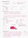
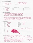
This is an oft recommended ink, and I can understand why. It is  a very standard looking medium blue with a hint of purple. There are other similar colors such as Waterman Florida Blue, J. Herbin Eclat de Saphir and Quink Washable Blue. But, what this ink has that those don’t is higher saturation. That fact makes this my favorite purplish blue ink of the bunch.

The Details:

  • No feathering or bleeding.
  • Great flow and lubrication
  • Average drying time
  • No shading
  • Surprisingly water-resistant

Now, last week I reviewed Noodler’s Baystate Blue. In my opinion, this is the closest BSB sub that I have seen. Of course it isn’t perfect. When you are trying to come up with BSB subs there are certain concessions that must be made. Firstly, you aren’t going to be able to get that trademark vibrancy that BSB is known for. There really aren’t any other inks on the market that will glow like BSB, so if that is the most important characteristic to you, then you might as well stick with BSB. Secondly, you aren’t going to get the same level of waterproofness from any sub. You can get some water resistance, but not 100% waterproofness.

In my opinion, Sapphire Blue is  a very similar blue with a bit more purple thanBSB. It is not as vibrant, but it still jumps off the page. It is almost as saturated. It has a pretty high level of water-resistance.

This sample was sent to me by the good folks at Diamine. I am not otherwise affiliated with them.

Swabs of New Platinum Mix Free Inks

1 Aug

(click to enlarge and sharpen the image)

I just received my 9 super samples of the new Platinum Mix Free line. I thought you all might want to see the swabs. I haven’t played around with the inks yet, but I will definitely put up some reviews as soon as I have formed opinions of them.

Initial Thoughts:

  • Smoke Black is a rather average black.
  • Earth Brown is a reddish-brown. It is very similar to J. Herbin Cafe des Iles.
  • Aurora Blue is one of my favorite. It is very similar to Diamine Sapphire Blue.
  • Aqua Blue is a nice turquoise blue. It is very similar to J. Herbin Blue Prevenche.
  • Leaf Green is also a nice green color. It reminds me a bit of J. Herbin Lierre Sauvage.
  • Silky Purple is definitely my favorite color of all these, and it is nearly identical to J. Herbin Rose Cyclamen. It’s very bright and a very red purple.
  • Cyclamen Pink is nearly identical to the long since discontinued Levenger Pinkly.
  • Flame Red is nearly identical to Noodler’s Dragon’s Napalm.
  • Sunny Yellow is a fantastically rich yellow.

Sample Kit retailers:

  • ISellPens.com sells a sampler for $20. In their kit you get a 10ml sample of each 9 colors of Mix Free inks, 2 extra bottles, and 2 ink syringes. This is where I purchased my kit.
  • GouletPens.com sells a sampler for $30. In their kit you get a 5ml sample of each of the 9 Platinum Mix-Free fountain pen ink colors in labeled plastic vials, a Goulet ink syringe set, and ten empty ink vials.
  • PearTreePens.com sells a sampler for $29.95. In their kit you get one 5mL sample of each of the 9 specially designed colors, one Write-Fill Kit, an empty full-sized ink bottle (of their choice), and three empty sample bottles.

There are several places you can get full bottles of Platinum Mix Free inks. Individual bottles are around $20 each. Many places are selling full-sized sets of all 9 inks for $149.

Happy mixing!

No Affil.

J. Herbin Rouge Fuchsia/Rouge Opera

15 Jul

These are reviews 2&3 of 6 for FPN member Alecgold.

J. Herbin Rouge Fuschia is a discontinued J. Herbin ink. It has been replaced by Rouge Opera. The two inks are nearly identical.

Both colors can be described as a dusky red rose sort of color. Rouge Opera seems a tinge more saturated and a little more lubricating than Rouge Fuchsia, but not by much. Honestly, with the bottle of Rouge Fuschia being so old these differences might just be a function of age. I’m unsure.

These colors are well-behaved as one would expect from a J. Herbin ink.

The Details:

  • Neither feather nor bleed
  • Flow and lubrication of Opera is a bit better than that of Fuchsia, but they are both good.
  • Both are fast drying
  • Fuchsia shades a bit better than Opera, but they are both good shaders
  • Neither ink is water proof or even really water resistant.

(click to enlarge and sharpen images)

Sorry for all the “fuchsia” spelling errors. That word has always tripped me up. You can see the spelling fluctuate in the scans. I’ll be more careful next time. *embarrassed*

All in all I think Rouge Opera is the better of the two inks. In my opinion there is no need to go in search of the discontinued Rouge Fuchsia.

Alec reviews 2&3 of 6. No affil.

Noodler’s Stylographic Pen, A Video Review

15 Oct

I was just going to do my standard write up, but I wanted to be able to demonstrate how easy it is to fill these pens up. There had been some confusion about that. This is my first video so be gentle. Videos are not really my thing, but I’ll tell you who does GREAT video reviews: Brian Goulet over at Ink Nouveau. You should check them out!

All in all this pen is decent for a roller ball; it writes a wet consistent fine/medium line. However, there is a reason I use fountain pens almost exclusively: roller balls aren’t the smoothest pens on the block. I will say this, I’d much rather have a refillable rollerball if I have to have one at all.

In the video I also compare the Creaper with a Dollar 717i. The pens are nearly identical, but I go over some differences as well. There is also a writing sample in there.

The only “issue” I have with the pen is that it squeaks as I write. I think it’s because the friction fit nib unit has a little play in it. I don’t know if this is normal or a malfunction. I’m hoping it settles down a bit with time.

I hope this is helpful. If you have any questions do let me know. I’ll be doing a more in-depth review of this pen at some point in the future.

(you’ll want to play the video at 480p) The writing test is at the end. Sorry.

No affil.

I purchased this pen from Todd at isellpens.com . As of the date of this posting, he is out of stock. I understand that he is expecting another shipment on 10/21. MSRP=$14

Swabs of 7 new Pelikan Edelstein inks

4 Oct

Brian of The Goulet Pen Company sent over a swab strip of the new Pelikan Edelstein colors, so I figured I might as well scan it and put it up for all to see.

I can’t say I’m very impressed by the new Pelikan offerings. Of them all I think Jade is the only one I’d consider buying. The colors just seem so average… too average to be sold at $20 a pop.

A review of Edelstein Sapphire is forthcoming. I’m testing it out now. All I’ll say is that it seems disturbingly similar to Quink Washable Blue.

What do you think? Would you pay $20 for these?

Quo Vadis Academic Year Planners + a Giveaway!

9 Sep

QV Septanote, Principal, Student, University

(click to enlarge or sharpen images)

The school year is now in full swing or close to it for many of us students, teachers, professors, and school administrators. I always like to start the school year off right by getting my schedule together and jump-starting organization plans for the year.

Now, being the inkophile and fountain pen lover that I am, I like a paper planner. I use Quo Vadis planners because I love the Clairefontaine paper in them, and I think they offer some of the most functional planner layouts on the market.

Today, I’ll be taking a look at 4 different Quo Vadis Planners: two desk-sized (Septanote and Principal) and two pocket-sized ( University and Student). I apologize in advance for the length of this blog post, but I’m trying to get through a lot of material here. There’s a giveaway at the end, so don’t forget to enter to win you own Quo Vadis Planner!

SEPTANOTE:

Now, this was the planner I used last school year. I LOVE IT! I was able to get this one at my school’s bookstore (how great is that?!). This planner is desk sized at 7 1/4″ x 9 1/2″. The paper is 90g Clairefontaine paper, and it comes in 3 different covers: Club, Soya, and Vinyl. The covers are refillable. Below is a picture of the planner page layout and one that shows how I used it last year:

QV septanote as used by me

Septanote Layout

As you can see, this one is intended for you to do some major major planning. For Monday-Saturday there is enough room to plan out all your meetings and obligations from 8am to 9pm. At the top of each day section is a place to note that day’s priority and at the bottom of each day section is a place for additional notes. On the far right are the following sections: phone, fax/email, see/do, pay/receive, and Sunday’s planning section. At the top on the far right you will find 3 mini monthly calendars, indication of the quarter, and the number week you are in.

As with most Quo Vadis planners, the Septanote comes with an abundance of extras: international phone code list, average temperatures around the world, notes sections at the front and back, year at a glance annual planning pages for the present and next school years, several maps, 3 yearly calendars, and a phone book insert.

The Vinyl Septanote sells for about $22, but you can usually find them for much less.

The standard year format of this planner is called the Trinote.

PRINCIPAL:

This school year is not going to be quite as hectic as the last, so I’m trying out a Quo Vadis Principal. The Principal comes in 5 different covers: Club, Soya, Nappa Leather, Chelsea Leather, and Vinyl. The covers are refillable. It is about the same size as the Septanote at 7″ x 9 3/8″, and has the same 90g paper, but the planning pages are much different:

QV Principal Layout

You still get a week at a glance, but the days are setup differently. For each day you still have space to note appointments between 8am and 9pm and each day had a section for additional notes. But, unlike the Septanote, the Principal gives each day its own dedicated sections for phone, email, and to-dos. With that, each day is fully contained in its own section. There are no shared sections. At the bottom left you have 3 larger monthly calendars along with an indication of the number week you are in.

The thing I like most about the Principal is that each day is self-contained while still keeping the events of the week together. However, there is some trade-off here. Namely, you do not get as much room for planning as you get with the Septanote, but if your weeks are a bit less hectic this might just be the desk sized planner for you.

The extras for this one include: Mon-Sat 8am-9pm master weekly schedule, year at a glance annual planning pages for the present and next school years, chart of international holidays, international phone code list, average temperatures around the world, several maps, 3 yearly calendars, and a phone book insert.

The Vinyl Principal sells for about $19, but you can find them for less.

Writing samples for desk-sized planners:

QV 90g writing sample

QV 90g very little show through

UNIVERSITY:

The Quo Vadis University is a pocket-sized planner at 4″ x 6″. This planner comes with a free Quo Vadis elastic band bookmark, and comes in 5 different covers: Club, Soya, Habana, Robert le Heros, and Vinyl. As you can see from the image below, it has almost the exact same planning format as the larger Septanote:

QV University Layout

However, there are several differences between this planner and its larger sibling. The biggest difference is the paper. Whereas the Septanote has 90g paper, the University has 64 g paper. The 64 g paper still performs quite well with fountain pens (see the image below). It is resistant to feathering and bleed through, but you do get more show through. You can still write on both sides of the page, just know there will be shadowing. Although this paper can handle wet wide nibs, I strongly recommend that you stick with medium nibs or finer in order to get the best results. Another difference between this and the Septanote is that you lose a notes section for each day though there is a general notes section to the far right. In addition, the section for Sunday is now stretched along the bottom of the page. On the far right you still have sections for phone, email, pay/receive, and to-dos. The final difference is that the top right only shows one monthly calendar instead of three.

Despite these differences, I still see this pocket-sized academic year planner as perfect for someone who needs to do a lot of planning and/or is always on the go. There is more space for planning here than one would normally get out of a pocket planner. Because of this benefit, I will be using this planner as the pocket companion to my Quo Vadis Principal.

Extras for the Quo Vadis University include: chart of international holidays, 2 Mon-Sat 8am-9pm master weekly schedules, year at a glance annual planning pages for the present and next school years, time zone map, Map of the USA and Canada, one notes page, 2 yearly calendars, and a phone book insert.

The Vinyl Quo Vadis University sells for about $11 but you can find them for less.

The standard year version of this planner is called Quo Vadis Business.

STUDENT:

Last up for consideration is the Quo Vadis Student. The Student comes in 3 cover options: Club, Soya, and Vinyl. This pocket-sized planner (6 5/8″ x 3 1/2″) is a departure from the rest here. It covers 17 months instead of 13, it is two weeks at a glance instead of one week, and it is not so much a planner as it is a diary.

QV Student Layout

As you can see, there is one week on each page. You have room to write down appointments from 8am-7pm. There is a calendar at the bottom of each page and the number week at the top of the page.

This diary is bare-bones, and is good for those who only need a place to write down appointments, commitments, and deadlines. This one is also good for those who want to look at more than one week at a time.

The paper here is also 64g like the University, so it takes fountain pen ink just as well.

Extras include: notes page, year at a glance annual planning pages for 17 weeks (1.5 school years), 3 Mon-Sat 8am-9pm master weekly schedules, an integrated address book, a yearly calendar, and a separate address book (Yes, that’s a second address book. Why? I dunno…).

The vinyl Quo Vadis Student sells for around $12, but you can find them for less.

The standard year version of the Student is called the Quo Vadis Biweek.

Writing samples for pocket-sized planner:

QV 64g writing sample

QV 64g prominent show through but still usable

In addition to the 4 planners I’ve outlined here, Quo Vadis offers many more options in academic as well as standard year format. They make planners of varying sizes, formats, and paper weights. If you’d like more information about other planners they off please visit their website at http://www.quovadisplanners.com/ .

GIVEAWAY!!!

I’m not going to be using the Quo Vadis Student planner (w/ green Club cover), so what better to do with it than give it away to one of my readers?! Even if you don’t need an academic year planner I encourage you to enter anyway. The standard year version of this planner is quite similar and uses the same paper.

Here’s what you need to know:

  1. Click here and fill out the form.
  2. You must enter by 11:59pm EST on Sunday, September 12, 2010.
  3. The winner will be chosen by Random.org
  4. I’ll let you know who’s the lucky winner on Monday, September 13.

The Principal, University, and Student planners were sent to me by the good folks at Exaclair. I am not otherwise affiliated with them.

Iroshizuku Tsukushi v Mont Blanc Toffee Brown

30 Aug

Up today is Iroshizuku Tsukushi (IT) and MB Toffee Brown (TB). I have to admit that I had very limited interest in trying Tsukushi until a friend of mine offered to give me a sample. In general, I’m not a fan of red browns, and all the scans I’d seen online showed a very red component to IT. I much prefer a straight brown like CdA Grand Canyon or Noodler’s #41 Brown. Once I’d tried IT I found it to be a cool toned medium saturated brown with an understated red component.

I actually stumbled upon TB as a Tsukushi substitute while at lunch with an FPN friend of mine. She had a pen filled with IT and I had one filled with TB. It was actually a bit difficult to tell the two apart. There are some differences though.

MB Toffee Brown is

Darker that IT
Higher saturated than IT
a little more red than IT
warmer/more golden than IT

Although the swabs highlight the differences between these two inks, if you take a look at the writing samples you can see a bit more of the similarity.

(click to enlarge and sharpen the images)


Another possible alternative to Tsukushi is De Atramentis Sepiabraun, however, I haven’t had to chance to try De Atramentis Sepiabraun, so I can’t really comment on how close it actually is.

If you have another suggestion for an alternative to IT please leave a comment below!

Disclaimer: The goal of these reviews is to find inks that are similar in color and behavior to the Iroshizuku line but at a lower price point. This should not be construed as an attempt to find exact replicas. That is not possible. The Iroshizuku inks succeed at being unique. The only way you can get an exact match is to save up for the Iroshizuku. Whether or not these suggestions work for you is entirely up to you.

No Affil.

Iroshizuku Fuyu Gaki v Diamine Vermillion

27 Aug

This red-orange-pink color category (just like violet) is near impossible to scan or photograph correctly. These images were scanned at 600dpi yet they are still pretty off. Nevertheless, I hope that these images can at least give you some indication of the differences between these two inks. Please note the color descriptions.

Up today is Iroshizuku Fuyu Gaki (FG) and Diamine Vermillion (DV). Color-wise, these two inks are nearly identical. FG is a medium red-orange with a slight pinkish undertone. DV is the same color but a shade or so lighter and a touch less pink. But be forewarned, Vermillion is a very VERY dry writing ink. Perhaps it is not as pronounces in a wider wetter nib, but it was particularly unpleasant with this Prera.

I’ve been asked how Noodler’s Dragon’s Napalm compares to FG. Well, for starters it is of much higher saturation. It also has a much more pronounced pink attribute to it. This is especially true when put through the same Pilot Prera Fine nib. It looks almost salmon pink through an extra fine nib. Another color that falls in this category is Diamine Coral. It is the same color as Napalm but less saturated. Napalm or Coral could be great alternatives to Fuyu Gaki if (and only if) you don’t mind a more obviously pink ink.

To recap:

Fuyu Gaki is
Medium in saturation
Red-Orange with a slight touch of pink undertone
Rich in color

Vermillion is
Medium low in saturation (a shade lighter than FG)
The same red-orange color with less pink than FG
A bit more dull in color than FG
VERY VERY DRY WRITING

(Please click to enlarge and sharpen these images)


Other possible alternatives:
Rohrer and Klingner Morinda (darker, more red. no pink)
Noodler’s Dragon’s Napalm (high saturation, brighter, much more pink)
Diamine Coral (Much more pink)

Do you have any substitute suggestions? If so, please let us know!

Disclaimer: The goal of these reviews is to find inks that are similar in color and behavior to the Iroshizuku line but at a lower price point. This should not be construed as an attempt to find exact replicas. That is not possible. The Iroshizuku inks succeed at being unique. The only way you can get an exact match is to save up for the Iroshizuku. Whether or not these suggestions work for you is entirely up to you.

The bottle of Diamine Vermillion was sent to me for review by the good folks at Diamine. I am not otherwise affiliated with them.

Iroshizuku Kon-Peki v. Diamine Mediterranean Blue v. Diamine Asa Blue

25 Aug

Now that I’m FINALLY back with all my review materials I can pick up where I left off on the Iroshizuku reviews and comparisons.

Today I’m looking at Iroshizuku Kon Peki (KP), Diamine Mediterranean Blue (MB), and Diamine Asa Blue (AB). Let me just start by saying that Kon Peki is a truer blue than either MB or AB. If you take a look at this swabbed comparison you can see that all three are roughly the same hue. They are swab from lightest (MB) to darkest (AB).

Mediterranean Blue is

Lighter than KP
Very slightly greener than KP
Feathers a bit more than KP

Asa Blue is

Darker than KP
Also slightly greener than KP
Flows better/faster than KP

While MB and AB are both quite similar to KP I think Mediterranean Blue is the better alternative in terms of color. However, take a close look at the review card and sheet for MB. It has some behavioral issues that might be a no go for some. If behavior is more important to you than the color match I’d choose Asa Blue as the alternative.

(please click to enlarge and sharpen the photos)


Other possible alternatives to Kon-Peki:
Noodler’s Eel Blue
Diamine WES Kensington Blue

Do you know of any other alternatives? If so, please leave a message listing them. We’d all appreciate it!

Disclaimer: The goal of these reviews is to find inks that are similar in color and behavior to the Iroshizuku line but at a lower price point. This should not be construed as an attempt to find exact replicas. That is not possible. The Iroshizuku inks succeed at being unique. The only way you can get an exact match is to save up for the Iroshizuku. Whether or not these suggestions work for you is entirely up to you.

The two bottles of Diamine were sent to me for review by the good folks at Diamine. I am not otherwise affiliated with them.

Iroshizuku Yama Guri vs. Caran d’Ache Grand Canyon Brown?

18 Aug

[tweetmeme source=”dizzypen” only_single=false https://dizzypen.wordpress.com%5D

Firstly, let me apologize for how long it is taking for me to get these reviews/comparisons up. I intended to do 3 a week, but they have turned out to be a lot more work than I bargained for. In addition, I’ve had some unexpected health distractions come up, so I’ve been away from the blog for about a week. I’m also in the middle of a move, so I’m going between two places that are 3 hours apart. I’m presently stuck at one of those places while all my review materials are at another place! This set of scans is the only set I have on this computer, so it’s probably going to be next week until I can start getting the other Iroshizuku reviews up. As if that weren’t enough, I’m a grad student, and I’ve got grad work that is taking a lot of time right now. I’m so sorry about this, but sometimes life just happens, and it’s happening to me at an astonishing rate!

Now for the review/comparison:

Iroshizuku Yama Guri (YG) and CdA Grand Canyon (GC) are the two browns that are responsible for my present love affair with brown ink. Now, you might be saying to yourself that these two inks are quite different. Well, yes they are, but hear me out! I still think GC can be a wonderful alternative to YG. Sure, there are inks that are a little closer in color, but they don’t come close to Iroshi’s behavior characteristics. CdA inks are some of the only inks that can go toe to toe with Iroshizuku behavior. It’s the behavior similarities that make GC the perfect alternative for me.

Yama Guri is

a dark cool brown that can have a sort of green sheen/tint to it in a wet writer
It doesn’t shade much

Grand Canyon is

A warmer brown with some golden undertones
It is not as dark as YG
It exhibits phenomenal shading

Here’s the thing though, if I’m honest, I actually like Grand Canyon Brown more than Yama Guri. Yes YG is a wonderful ink, yes the behavior is fabulous, but there is still something missing for me. GC has that something I’m looking for. What’s more, GC is every bit as well behaved.

(click to enlarge and sharpen the photos)

Other alternatives:
Rohrer & Klingner Sepia: Darker, not as well behaved
Noodler’s #41 Brown: not as well behaved, bullet proof
Diamine Saddle Brown (maybe): a little less saturated

Disclaimer: The goal of these reviews is to find inks that are similar in color and behavior to the Iroshizuku line but at a lower price point. This should not be construed as an attempt to find exact replicas. That is not possible. The Iroshizuku inks succeed at being unique. The only way you can get an exact match is to save up for the Iroshizuku. Whether or not these suggestions work for you is entirely up to you.

ETA 06/28/2011:

At their retail prices both are approximately $1.67 per ml. However, in terms of initial upfront cost the Caran d’Ache is more affordable even though you pay the same price per ml in the end. At the end of the review I list other inks that come pretty close to Yama Guri at a much lower price per ml.

But, honestly, I’m never going to get through 50ml of this ink. I have SO many bottles/samples of inks and several other browns. I can’t even hope to get through 30ml of it, so that makes the price per ml even less relevant for me. So if, like me, you are more concerned with the upfront cost as opposed to the cost per ml, then Caran d’Ache is a good alternative.

No Affil.

Share