Tag Archives: thoughts

Surfacing for air…

14 Jun

Hey all,

It’s been a VERY long time since I’ve posted anything.

As some of you know, I have been ill. I have been focused to getting better rather than blogging. I am glad to say that I am doing much much better now, and I hope to be back to blogging within the week.

Cheers,

Dizzy

Reflections

5 Jan

It’s 2011. I can hardly believe that 2010 has come and gone already.

2010 has a year of change for my beloved hobby, all things fountain pen.

In 2010, my review archive morphed into a full-fledged blog. In some ways, that change was thrust upon me. My archive was hosted on LiveJournal, but in June I moved it. LiveJournal made some changes to their format that killed the functionality of the site (unless you wanted to pay for a membership that is). I ended up with far less control of my archive and far FAR more invasive ads. After much research, I settle on WordPress. In June, my new site launched. With the increased functionality came an increase in reviews, and with the increase in reviews came an increase in my readership. And, with that, what started as a place for me to store and easily access my reviews turned into a blog. I now received requests for reviews and samples from manufacturers and retailers. I review those things in addition to my own FP related items. From June to December of 2010, my site has received a total of 34,000 hits. I can hardly believe it. It’s really been a fantastic journey. I’d like to thank each and everyone of you for your visits and your support.

My blog is not the only aspect of my hobby that changed in 2010. My accumulation of ink has nearly trebled in the last year. I now have around 80 bottles of ink and well over 50 ink samples. I’m still reviewing as I go. At present, I have a backlog of about 30 ink reviews that are waiting to be scanned and posted here on The Dizzy Pen.

While my ink accumulation increased, my pen accumulation decreased. In 2010, I sold off and gave away quite a few pens. I got my core selection down to about 14 pens plus a handful of Platinum Preppies, Noodler’s pens, and various other “cheapos”. Although I still plan to make changes, I’m quite happy with my pens.

Perhaps the biggest change for me has been my office. I consider my office a part of my hobby. It is not only the place I do all my schoolwork, but it is also the place I use and play with my pens and inks, write my reviews, scan them in, and post them online. In 2010, I moved to another part of the state and into a smaller place with a smaller office space. It took a few months, but I think I’ve finally gotten it where I want it.


I have a writing desk set up in front of the window so that I can look out at the forest behind my home. Of course, my pens are on that desk. The ones in the wooden holders are inked (there are far too many inked right now). My uninked pens are actually in the bottom drawer of my inbox (shown on the right side of the desk). Underneath that desk is the paper shredder and my manual typewriter.

The computer desk is against the wall to the left of my writing desk. Above the computer desk are my ink shelves. My ink bottles are in the two purple boxes. My ink samples are in the top basket, and my empty Nalgene bottles, syringes, pipettes, etc are in the bottom basket. If you look very closely, you can see my newest addition, a 16 ounce bottle of Noodler’s Navy. How awesome is that?!

Of course, no office is complete without a printer. My Canon Pixma MX 870 sits between my two desks. It is a fantastic all-in-one printer. The scanner is particularly good. If you are in the market for an all-in-one, I highly recommend this printer.

Not shown in this picture are my bookcases. They are on the wall to the right of my writing desk. My office doubles as my husband’s closet and the ironing room. Obviously, I’ve left those out as well.

I’m excited to see what 2011 will bring. I’m sure there will be new inks and new pens. Some of my accumulation will probably be re-homed. At some point I’ll be moving again, so my office will change. But, most of all, I’m excited to see what will happen with The Dizzy Pen. I can promise many more reviews and giveaways, but, as for the rest, we’ll just have to wait and see…

Quo Vadis Habana to be discontinued in its current form…

16 Dec

Yesterday Quo Vadis Blog announced that they would be introducing a change to the Quo Vadis Habana.

At this time, the Quo Vadis Habana comes with a leatherlette cover (not unlike the Rhodia Webnotebook) and with 90 g bright white paper. In 2011, the paper in the Habana will be changed to a 85 g ivory paper. Personally, I think this is a bad move from the company that usually gets it right. What do you think?

“In 2011, we’ll be switching our Habana notebooks over to the same paper as Quo Vadis France. The ones we sell in North America will still be made in the US, but they’ll now contain ivory colored paper that’s 85g in both small and large (and lined and unlined) versions.

The decision was made in the interests of international standardization.”

Read more here: Habana News


My Writing Arsenal *Updated*

9 Dec

In February I put up a blog post about my arsenal. That is the list of the items in my accumulation that I could not live without. Needless to say, my opinions have changed with my collection. In addition, as I get deeper and deeper into my school work, my needs have changed tremendously. So, it’s time for a bit of an update (OK, more than a bit of an update. This is a long post. You’ve been forewarned!)

Pens:  Pilot VP, Pilot Custom 823, Pilot Prera, TWSBI Diamond 530, Edison Glenmont

Until I started this posted I had not realized just how much I use and rely on my Pilot pens. I would have never described myself as a Pilot fan, but I guess this makes me one doesn’t it?

The VP remains the perfect note-taking pen. The click/retractable nib mechanism makes it perfectly suited for jotting down quick notes in a meeting or when on the go.

I purchased the 823 (review forthcoming) specifically for use in drafting my long papers, articles, and chapters. It is really perfect for that task. It holds over 2ml of ink when I use my Visconti Inkpot (review forthcoming) to fill it. The Broad nib is juicy and smooth which makes writing fun while also forcing me to slow down.

My little Brown Prera (review forthcoming) is my editing, grading, and marginalia pen. It’s super fine and smooth nib makes it perfectly fit for that purpose. It’s also a comfortable little pen.

The TWSBI was also purchased with long writing sessions in mind. Boy is it a winner! I love that thing. I use it most everyday.

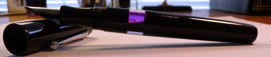
My Glenmont remains a favorite especially for letter writing, but then I designed it myself, so why wouldn’t it be?

The Stipula Vedo and Levenger Plumpster have fallen off the list. I still like them quite a bit, but as my workload has changed so have my writing instrument needs. The Vedo’s nib is a bit too sharp for long writing sessions and the Plumpster lacks the ink capacity I need for lots and lots of writing.

Inks: Noodler’s Navy, Noodler’s #41 Brown, J. Herbin Poussiere de Lune

Noodler’s Navy has become my workhorse ink. It’s near-bulletproof, so I don’t have to fear for my writing’s longevity. It’s an unassuming and relatively nondescript dark blue, so it’s not at all distracting. It’s extremely well-behaved no matter what I throw at it. To me, this is the definition of workhorse. I’m seriously considering ordering a 16 ounce bottle of the stuff… maybe I should make that 32 ounces just to be on the safe side?

Noodler’s #41 Brown is a great dark brown. It’s very well-behaved and bulletproof to boot. I’m entering a phase in my writing where I need to know that it will survive the odd spill (I’ve got a story behind this, but that is for another time).#41 accomplished this goal while still being nice to look at.

I love purple inks, so it’s only right that one be on this list. Poussiere de Lune is just the ticket. I have a lot of purple inks, but this is one of my favorites. It also has a good measure of water resistance. That is a must.

Visconti Blue has fallen off the list, but I still believe it belongs in every ink collection. It is the perfect medium dark blue to me. It is exceedingly well-behaved, and it is vibrant enough to set you part from the crowd while still maintaining its professional air. The only problem for me is that it offers absolutely no water resistance. It this point, water resistance is non-negotiable.

MB Violet has fallen off this list as well. I still love it and it still holds all the sentimental value it did before, but I just don’t use it as much as I used to.

Journals: I still haven’t found “the one.” I do still use and quite like my Exacompta Basics sketchbook, but I’m not sure it is the one. I’ve tried and loved the Rhodia Webnotebook, but I haven’t had it and used it long enough to know if it is really “the one.” After I finish the Exacompta, the Webbie is going to become my dedicated journal. We’ll see what happens.

Stationery: American Stationery Business Monarch and Crane’s 90gsm Pearl White

I still use the Business Monarch as much as I did.  I’ve also developed a fondness for the Crane’s paper. Lately, I’ve been using it almost exclusively. My pens and inks love both these papers, and the papers certainly look the part.

Paper for everyday use: HP LaserJet 24lbs.

I simply cannot say enough good things about this paper. All of my pens and inks love it. It is smooth and it resists feathering and bleed through. At $9.99 per ream of 500 sheets it is quite affordable. The local big box office supply stores often run 2 for 1 specials on it, so that’s 1000 sheets for $10. That’s some of the better rates I’ve seen for good quality consistent paper. I go through a lot of this paper, and it does not break the bank. This is always a good thing when it comes to the student budget.

Staple’s Bagasse has fallen off the list. It has become a bit inconsistent, and I’m no longer a fan of its thin crispy feel and lined rule. It also bleeds like crazy.

Planner: This category is presently in flux. I had been using and loving a Quo Vadis Septanote, but I thought I’d do better with a pocket planner. This academic year I’ve switched to the Quo Vadis University. It is quite similar to the Septanote, but it’s pocket-sized. So far so good, but I still need a desk planner I love. I’m trying out the Quo Vadis Principal, but I’m not sure I like it.

Misc.: Circa Desk Punch, Rollabind discs, Large Staples Rolla Notebook

When I made my first arsenal post I speculated that the Circa punch would become a staple. Well, it has in a big big way. I was able to get one of the older versions for $30 from the Levenger Ebay Outlet. That plus Rollabind discs also from Ebay had me all set to punch and organize. Covers were and are, to some extent, an issue. Levenger covers are expensive, so I went on a search for cheap cover options.

While at Staples I noticed a Rolla Notebook. It is, of course, disc bound with a stiff yet padded black faux leather cover. It fits 8.5×11 paper, so it seemed perfect. I got it home, and I tried it out. The paper sucks SUCKS, so I recycled it and refilled the Notebook with my beloved HP LaserJet paper. PERFECTION!!!

———————-

So there you have it. These are the writing products I cannot live without. How about you? What are you using and loving these days?

Swabs of 7 new Pelikan Edelstein inks

4 Oct

Brian of The Goulet Pen Company sent over a swab strip of the new Pelikan Edelstein colors, so I figured I might as well scan it and put it up for all to see.

I can’t say I’m very impressed by the new Pelikan offerings. Of them all I think Jade is the only one I’d consider buying. The colors just seem so average… too average to be sold at $20 a pop.

A review of Edelstein Sapphire is forthcoming. I’m testing it out now. All I’ll say is that it seems disturbingly similar to Quink Washable Blue.

What do you think? Would you pay $20 for these?

Calling all artists! Can you draw me a dizzy pen?

19 Aug

[tweetmeme source=”dizzypen” only_single=false https://dizzypen.wordpress.com%5D

I really wish I could draw, but alas I cannot.

I’d really like to have a drawing of a fountain pen (personified) that appears to be dizzy.

I’m thinking the pen is at an angle with star and dizzy lines (maybe birds) swirling around its head. Maybe even with its eyes crossed or something like that.

I know it sounds silly, but it’d be really nice. If you want payment we might be able to work something out…

Can anyone help with this? If you can please reply here or send an email to dizzypen at gmail dot com.

Thanks a lot!

I’m thinking something along these lines:

image from herbalgranny.com

Beware Online Ink Swatches (via An Inkophile’s Blog)

14 Jul

Margana at An Inkophile’s Blog is one of my very favorite bloggers. She always tells it like it is, and her most recent post is no exception.

We can all get a little obsessed about finding/doing something perfect, but perfection is out of our reach. Humans are fallible and our machines are even more so.

It simply is not possible to create a perfect computerized image of any color sample. The way the human eye sees color only confirms this. Our vision, lighting, alertness, and so on all affect the way we see a color. The line width, wetness, flexibility, paper type and so on affect the way ink looks on the page. And then there’s the fact that many of us (and this is especially true of men) suffer from some degree of color-blindness! Not to mention the inability of computerized images to capture the vibrancy, depth and so on of any given color. There are too many variables of which only a small fraction can be controlled.

So, even if we could get an ink color to “look perfectly accurate” on the screen it is still more likely than not to vary greatly from the color we see when we put ink to paper.

We all see color differently image quality aside. This is why one person might see J. Herbin 1670 ink as red-orange while another sees it as blood red while yet another see it as a true red. Just look at any three ink reviews and you’ll see everyone describe the color differently.

The best we can do is approximate a color. Anyone looking at an online sample as perfect is setting themselves up for disappointment, and anyone claiming to have a perfect scan is setting themselves up to field complaints about how people feel they were misled.

As Margana says, you really do have to see an ink on the page in order to know whether or not it is the one for you. Please take a carefully look at what she says. She’s right on the money so far as I’m concerned.

The subject of online ink swatches and color representation has come up several times this past week. Some of us have learned the hard way that anything we see on a monitor is as likely to be inaccurate as not. Frustrating but so is buying an ink that disappoints. Even the so-called color adjustment aids are no guarantee. A respected inky friend reminded me just yesterday how true this is. Since the specific ink in question was developed with her … Read More

via An Inkophile’s Blog

TWSBI Diamond 530, A Mini Review

7 Jul

[tweetmeme source=”dizzypen” only_single=false https://dizzypen.wordpress.com%5D

twsbi capped 2

ETA: To read the Full Review click here! 10-6-10

I don’t normally do this, but I’ve had several requests for my preliminary thoughts on this pen. These are my initial impressions. A more thorough review is a few weeks out. I generally like to live with a pen for a good while before drawing my conclusions. I will say that I am impressed by the TWSBI Diamond 530 in spite of a couple issues. NOTE: TWSBI has informed the pen owners of an issue with the piston seal. If your TWSBI is leaking at the piston seal please email Speedy about getting a replacement part. For more information click here.

For some reason I wrote Mont Blanc 149. I meant to write Mont Blanc 146. The 149 is HUGE. The TWSBI is not nearly as big. Sorry.

twisbi mini review

No Affil.

Share

I Just Purchased a Manual Typewriter!

29 Jun

[tweetmeme source=”dizzypen” only_single=false https://dizzypen.wordpress.com%5D

Someone posted a question on FPN about manual typewriters and whether anyone owned one. This immediately peaked my interest. I love all things old and writing related, so why not? It’s a writing instrument right?

After about half a second of thought I decided I absolutely had to have one. I ran it past hubby; he showed no objections. So, off to the antique stores I went. After three hours of searching and a couple hours of wiping, scrubbing, and oiling here’s what I got:

This is a 1950 Royal Quiet De Luxe manual typewriter!

Royalquietdeluxe2

Royalquietdeluxe

It was in exceptional condition, and it is in perfect working order. I’ve already been typing away on it.

Anyway, this is just a sneak peak. There will be a typecast review of it in a few weeks!

Share

Tips For Buying From A Pen Board (via An Inkophile’s Blog)

23 Jun

This is sounds advice, and a highly recommended read. Just like Inkophile, I was recently burned in a message board pen deal. Like her the seller agreed to pay for the nib to be fixed, but it was more of a hassle than I bargained for.

Read. Digest. Integrate.

Dizzy

This truly is a long post. Not interested in reading the details? If I were you I might not either so key points are listed below for those who prefer CliffsNotes to the full story. No offense taken if that works for you. Key Points: Don’t let the pressure (competition) best your common sense. Message board participation does not make a reliable seller. Read the fine print as well as between the lines. Ask questions and pay close attention to how … Read More

via An Inkophile’s Blog