Tag Archives: Red/Red-Orange/Orange

Swabs of New Platinum Mix Free Inks

1 Aug

(click to enlarge and sharpen the image)

I just received my 9 super samples of the new Platinum Mix Free line. I thought you all might want to see the swabs. I haven’t played around with the inks yet, but I will definitely put up some reviews as soon as I have formed opinions of them.

Initial Thoughts:

  • Smoke Black is a rather average black.
  • Earth Brown is a reddish-brown. It is very similar to J. Herbin Cafe des Iles.
  • Aurora Blue is one of my favorite. It is very similar to Diamine Sapphire Blue.
  • Aqua Blue is a nice turquoise blue. It is very similar to J. Herbin Blue Prevenche.
  • Leaf Green is also a nice green color. It reminds me a bit of J. Herbin Lierre Sauvage.
  • Silky Purple is definitely my favorite color of all these, and it is nearly identical to J. Herbin Rose Cyclamen. It’s very bright and a very red purple.
  • Cyclamen Pink is nearly identical to the long since discontinued Levenger Pinkly.
  • Flame Red is nearly identical to Noodler’s Dragon’s Napalm.
  • Sunny Yellow is a fantastically rich yellow.

Sample Kit retailers:

  • ISellPens.com sells a sampler for $20. In their kit you get a 10ml sample of each 9 colors of Mix Free inks, 2 extra bottles, and 2 ink syringes. This is where I purchased my kit.
  • GouletPens.com sells a sampler for $30. In their kit you get a 5ml sample of each of the 9 Platinum Mix-Free fountain pen ink colors in labeled plastic vials, a Goulet ink syringe set, and ten empty ink vials.
  • PearTreePens.com sells a sampler for $29.95. In their kit you get one 5mL sample of each of the 9 specially designed colors, one Write-Fill Kit, an empty full-sized ink bottle (of their choice), and three empty sample bottles.

There are several places you can get full bottles of Platinum Mix Free inks. Individual bottles are around $20 each. Many places are selling full-sized sets of all 9 inks for $149.

Happy mixing!

No Affil.

Pelikan 4001 Brilliant Red

21 Jul

This is the 5th of six reviews I’m doing for FPN member Alecgold.

Up today is Pelikan Brilliant Red. I really haven’t the slightest idea why they would call this color “red”. It’s a pink-orange not unlike Noodler’s Dragon’s Napalm, Diamine Vermillion, or Diamine Coral. I will say that the “brilliant” portion of the name is quite fitting. This ink definitely jumps off the page at you. As such, it would make a great editing ink, but honestly, I’d rather have Noodler’s Dragon’s Napalm. It is bolder and brighter still.

The Details

  • No feathering or bleeding
  • Good flow, Average lubrication
  • Average drying time
  • Good shading
  • Disappears at the mere thought of water.

This color is near impossible to get right. The scans were completely useless, so I went for a photo instead. The photos are better, but they’re still not great. I did the best I could.

(click to enlarge and sharpen the images)


Alec review 5/6. No affil.

J. Herbin Rouge Caroubier

18 Jul

This is the 4th of six reviews I’m doing for FPN member Alecgold.

Up today is JH Rouge Caroubier. I don’t really have much to say about this one. It is just red. If you are in the market for a standard “true” red with is extremely well behave (although not water-resistant), then this is your ink.

The Details:

  • No feathering or bleed through
  • Excellent flow and lubrication
  • Fast drying time
  • Good shading
  • Not even remotely water resistant.

(click to enlarge and sharpen the images. They look a little more pink than in reality.)

Alec review 4/6. No affil.

Diamine Oxblood

17 Dec

Earlier this week I reviewed Diamine Red Dragon. Today’s ink, Diamine Oxblood, is cut from the same clothe so to speak. As a matter of fact, if someone told me that Red Dragon was stumbled upon while trying to manufacture Oxblood I’d believe it. The differences, however, are obvious. Oxblood is much darker, and has a bit more brown in it. It definitely has the look of blood.

The ink itself is exceptionally well-behaved. Further, although I’m not one to use red ink for everyday tasks, this ink would be perfect in that role. It is a very subdued color, and it’s very easy on the eyes. I like it!

The Details:

  • No feathering or bleeding
  • excellent flow and lubrication
  • Average drying time
  • Minimal to no shading
  • Not waterproof, and only minimally water-resistant.

(click to enlarge and sharpen the image)

This bottle of ink was sent to me for review by Diamine. I’m not otherwise affiliated with them.

Diamine Red Dragon

15 Dec

This is one of the more recent additions to the Diamine line up. It’s also one that was proved to be quite popular. Red Dragon is a dark red color, but it’s not at all brown. It’s actual very similar to another recent Diamine release–Diamine Oxblood–, but Red Dragon is lighter and redder. Red Dragon also seems rather similar to Diamine Monaco Red, but it does not appear as brick red / red-brown.

All in all, I quite like this red. It’s vibrant, but not cloyingly so. It’s pretty well-behaved. This would make a great red for editing or for use in the workplace. I definitely recommend it.

The Details:

  • No feathering except for poorer quality papers, but even then it isn’t significant.
  • No bleed through.
  • Excellent flow and decent lubrication.
  • Drying times are average
  • There is some shading, but it isn’t extraordinary.
  • Unfortunately, no water resistance.

(Click to enlarge and sharpen the image)

This bottle of ink was sent to me for review by Diamine. I’m not otherwise affiliated with them.

Rohrer & Klingner Morinda

11 Oct

After putting up my last R&K review, I realized that some of you may not be familiar with this line of inks. Below is a blurb from their website:

With this range that contains 18 tones of writing inks for fountain pens and quills, Rohrer & Klingner continues an old tradition of ink production. Apart from classical tones (including two iron gall inks), several new colors are
available, that have been developed for the primary purpose of calligraphy. On a traditional basis, R & K inks are produced with modern raw materials.

Rohrer & Klingner inks feature high-class, brilliant colorants, specially treated water and minimal amounts of additives. This well-balanced composition causes the optimal capillarity of the inks and the accordingly good writing conduct. It is suitable for pens, quills and other calligraphy utensils. Economical and ecological reasons make piston-filler pens and
convertible pens particularly attractive. The convertible pen features a separate tank with a piston-filler.

On most writing surfaces (including paper) R & K ink adheres well and, according to its capillarity, quick. Each of the Rohrer & Klingner inks are treated with high quality, pleasant dyes, that feature both a high brilliance and a well-balanced intensity. The colors of the iron gall inks intensifies when it oxidizes on the air; Hence, writings with those inks are considered permanent, the historical term being “archivally safe”.

I’m not the biggest fan of reddish inks, so the first time I tried this ink I did not like it. I’ve since warmed up to it quite a bit.

As with all reds in my ink collection, this one is destined for use as a grading, marginalia, and editing ink. I just can’t see red any other way. As a grading ink I’d say this one is pretty good. It’s not overly bright, but stands out in a sea of black. The only problem is that it can be washed away with ease.

I’m not sure I’ve ever tried a color like this. There’s something vaguely orange about it, but not enough to really call it a red-orange. Perhaps it can be described as a lighter redder duskier version of Diamine Monaco Red? Or a duskier darker version of Iroshizuku Fuyu-Gaki?

The Details

  • No feathering or bleeding
  • Good flow and lubrication
  • Saturation is average to medium high.
  • Fast drying time with this very fine nib
  • Little to no shading (at least with this pen)
  • Not waterproof or water resistant. Washed dead away.

(Click to enlarge and sharpen the image)

This ink sample was sent to my for review by Ryan at Pear Tree Pens. I am not otherwise affiliated with them.

Iroshizuku Fuyu Gaki v Diamine Vermillion

27 Aug

This red-orange-pink color category (just like violet) is near impossible to scan or photograph correctly. These images were scanned at 600dpi yet they are still pretty off. Nevertheless, I hope that these images can at least give you some indication of the differences between these two inks. Please note the color descriptions.

Up today is Iroshizuku Fuyu Gaki (FG) and Diamine Vermillion (DV). Color-wise, these two inks are nearly identical. FG is a medium red-orange with a slight pinkish undertone. DV is the same color but a shade or so lighter and a touch less pink. But be forewarned, Vermillion is a very VERY dry writing ink. Perhaps it is not as pronounces in a wider wetter nib, but it was particularly unpleasant with this Prera.

I’ve been asked how Noodler’s Dragon’s Napalm compares to FG. Well, for starters it is of much higher saturation. It also has a much more pronounced pink attribute to it. This is especially true when put through the same Pilot Prera Fine nib. It looks almost salmon pink through an extra fine nib. Another color that falls in this category is Diamine Coral. It is the same color as Napalm but less saturated. Napalm or Coral could be great alternatives to Fuyu Gaki if (and only if) you don’t mind a more obviously pink ink.

To recap:

Fuyu Gaki is
Medium in saturation
Red-Orange with a slight touch of pink undertone
Rich in color

Vermillion is
Medium low in saturation (a shade lighter than FG)
The same red-orange color with less pink than FG
A bit more dull in color than FG
VERY VERY DRY WRITING

(Please click to enlarge and sharpen these images)


Other possible alternatives:
Rohrer and Klingner Morinda (darker, more red. no pink)
Noodler’s Dragon’s Napalm (high saturation, brighter, much more pink)
Diamine Coral (Much more pink)

Do you have any substitute suggestions? If so, please let us know!

Disclaimer: The goal of these reviews is to find inks that are similar in color and behavior to the Iroshizuku line but at a lower price point. This should not be construed as an attempt to find exact replicas. That is not possible. The Iroshizuku inks succeed at being unique. The only way you can get an exact match is to save up for the Iroshizuku. Whether or not these suggestions work for you is entirely up to you.

The bottle of Diamine Vermillion was sent to me for review by the good folks at Diamine. I am not otherwise affiliated with them.

Red Comparison

22 Jul

This post originally appeared on The Ink Nouveau, but since I use this blog as an archive I thought it best to put it up here as well.

(Click on any photo to view a larger size)

When Brian put out a request for guest reviewer I immediately volunteered. Since the J. Herbin 1670 ink had just launched I thought it would be worthwhile to do a comparison of red inks from a few of the manufacturers he carries. Brian sent me a sample of every ink reviewed here except the Diamine Monaco Red. I already owned that one. Apart from being a customer of his I am not otherwise affiliated with Brian. I am also not affiliated with any of the manufacturers reviewed herein.

Diamine Classic Red:

Dia Classic Red Card

I must admit that this was by far my least favorite of the bunch. It is the only one that misbehaved on my everyday paper: HP LaserJet 24lbs. However, it does perform well on Rhodia, Clairefontaine, etc. If you plan to use this ink plan to use it with premium papers. The shading is quite good and the flow is excellent. I’m not much on the color, but the name is fitting. It is a dullish medium red.

Caran d’ Ache Sunset:

cdasunsetcard

This is an attractive pinkish red. It is the outlier in this group. None of the others exhibit this pink quality. This ink is the driest feeling of the bunch. But, has some of the best shading, and it is one of the fastest drying.

Private Reserve Dakota Red:

PR Dakota Card

This is a brightish medium red. When I researched this ink I found some complaints of the ink clogging pens and/or throwing precipitants. When I informed Brian of this he told me the ink has been reformulated, so I decided to test it out for a while. I put it in a Platinum Preppy and left it to sit for one and a half weeks. I am happy to report that there was NO CLOGGING and NO PRECIPITANTS.

Believe it or not, this ink is actually the best behaved out of the bunch. There is some shading, and it is fast drying. It flows well, and it is pretty good so far as lubrication is concerned. In addition, it is one of the least saturated, but also the most water-resistant. All in all not a bad ink.

Diamine Monaco Red:

diamonacocard

This ink is from my own personal stash. I tend to use it for grading because its brick red blood color is dark enough to be easy on the eyes, but still red enough to catch the students’ attention. It is very well-behaved even on cheap student paper. I prefer it in an extra-fine or fine nib, but in a wider nib you get lots more shading.

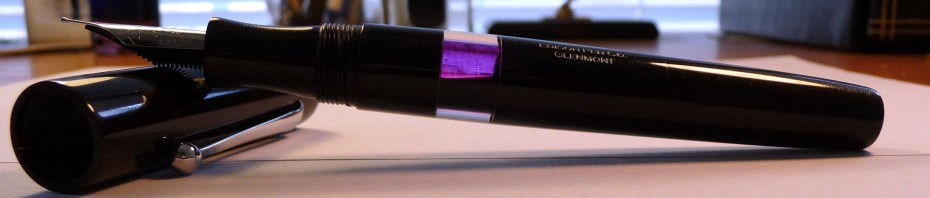
J. Herbin 1670 Rouge Hematite:

JH 1670 Card

Now for the ink of the moment! This ink is FANTASTIC! I have to say that I’m not the biggest red ink fan in the world, but as soon as I got this ink down on paper I was enamored. Furthermore, of the inks Brian sent to me this is the only one I went out and purchased (Brian is expecting a shipment soon. Until then, make sure to contact him to be placed on the waitlist). The color is similar to that of fresh blood. I’d describe it as a red-orange mixed with maroon. It’s very appealing. It’s also quite vibrant, but not unpleasantly so. It has the best flow and lubrication of the inks compared here. It is also the most saturated, which is surprising for J. Herbin. Unfortunately, because of that saturation this ink is slow drying and it remains smudge-able long after it is dry. Do note that this is a limited edition ink, so if you want some you may want to act fast!

———-

Below are a couple comparison shots and a picture of the water test. I apologize in advance for the colors. I simply could not get these comparisons to display all the reds accurately. Please refer to the card shots above for more accurate representations of these inks.

Red Rhodia Comp

Red Pupitre Comp

Red water test

DizzyPen
http://www.dizzypen.wordpress.com

J. Herbin 1670 Rouge Hematite

16 Jul

[tweetmeme source=”dizzypen” only_single=false https://dizzypen.wordpress.com%5D

Photo from gouletpens.comThis limited edition ink was created in celebration of Herbin’s 340th anniversary. It is meant to be reminiscent of their original sealing wax. Here’s a bit of history on the ink from Rhodia Drive:

“J. Herbin was established in 1670 in Paris nearby the towers of Notre-Dame.

Ink production started during the First French Empire. The inks were used by Napoleon Bonaparte, and then by his son, the King of Rome. During the 19th century, Herbin participated in many great international exhibitions including the London exhibit in 1823 where he was given an award for the exceptional quality of his inks and waxes.

Today, Herbin inks are widely used and internationally renowned. To celebrate the 340th Anniversary of the brand,we are introducing the “1670” ink especially made for this event. With a dark red color and earthy tone, it is a reminder of the historic color of the Herbin logo and the sealing wax used by the members of the royal courts. This rich deep dye ink will bring brightness and majesty to all your writing.”

This ink is FANTASTIC!  I wouldn’t describe myself as a huge red ink fan. In fact, I only use red ink for grading and editing, but as soon as I had a chance to get this ink in a pen I knew I just had to have some. And honestly, it’s a Limited Edition ink from one of my favorite ink makers. I wouldn’t be an inkophile if I passed on purchasing this ink now would I? So, I went down to the local B&M store and purchased the last bottle they had in stock! Interesting story about that, but I’ll save it for another time.

The Details:

  • It’s quite vibrant, but not unpleasantly so.
  • This ink is highly saturated. I normally don’t note this type of thing, but this is an uncommon quality to find in a J. Herbin ink.
  • There is a good chance that you will damage the wax on the cap when you open the bottle (See comments below. Herbin is working to fix this issue.), and upon opening it you will find a very small bottle opening. If you routinely use large pens be ready to decant this ink into a more suitable container.
  • No feathering or bleed through.
  • Excellent flow and lubrication. It’s honestly some of the best I’ve ever experienced.
  • The drying time is glacial. It took at least 15 seconds to “dry” and remained smudgy even the next day! Lefties and those with sweaty hands beware. If you use super juicy wet writers on only slightly absorbent paper beware…
  • The shading is to die for.
  • It is not even remotely waterproof.

JH 1670 Card

I received a sample of this ink from Brian at The Goulet Pen Company . I subsequently purchased a bottle of it from a local B&M store. Brian had it back ordered with a wait-list. Apart from being a past customer of Brian’s and a guest blogger on The Ink Nouveau I am not otherwise affiliated with The Goulet Pen Company or any other person or company affiliated with J. Herbin.

Share

Pink-Orange/Orange Comparison

1 Mar

Finally, I had a bit of sunlight coming through my window so I could get a good picture of this sheet. These colors are difficult to photograph, but I’ve done my best, and they seem pretty true to color to me.

pink orange comp

  • Iroshizuku Fuyu-Gaki. This is a red-orange, but there is something coral/pink about it in my eyes. I like it very much.
  • Noodler’s Dragon’s Napalm. What a fun color! I don’t know what I’d use it for, but it is visually appealing. Definitely a Pink-Orange color.
  • Diamine Coral. This is surprisingly similar to Dragon’s Napalm. It is, however, a bit more orange. Still quite a nice pink orange.
  • JH Orange Indien. This is one of my favorite oranges. Seems a straight orange to me. Very little red.
  • Iroshizuku Yu-Yake. This has a little more red to it than Orange Indien. It does not photograph well here. Quite a lovely orange.
  • Private Reserve Orange Crush. I think my bottle may be turning a bit, which is a problem with this ink. It was a bit more orange several years ago, now it’s an orange-brown sort of color. I still like it though.