Tag Archives: j. herbin

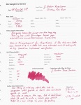
J. Herbin Café des Iles

22 Jul

This is the last review in the FPN member Alecgold review series.

While I really love J. Herbin inks, I really dislike this one. It is one of the weakest/lowest saturated inks I’ve used from them. I’d describe this color has a brown with reddish undertones.

I prefer much bolder colors than this. Still, it has all the wonderful characteristics of a JH ink. So long as you don’t mind low color pay off, you might quite like this ink.

The Details:

  • Little to no feathering
  • No bleeding
  • Good flow and Lubrication
  • Fast to average drying time
  • Very good shading with the right pen/paper combo
  • Not waterproof and very little water resistance

(click to enlarge and sharpen these images)

Alec Review 6/6. No affil.


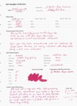
J. Herbin Rouge Caroubier

18 Jul

This is the 4th of six reviews I’m doing for FPN member Alecgold.

Up today is JH Rouge Caroubier. I don’t really have much to say about this one. It is just red. If you are in the market for a standard “true” red with is extremely well behave (although not water-resistant), then this is your ink.

The Details:

  • No feathering or bleed through
  • Excellent flow and lubrication
  • Fast drying time
  • Good shading
  • Not even remotely water resistant.

(click to enlarge and sharpen the images. They look a little more pink than in reality.)

Alec review 4/6. No affil.

J. Herbin Rouge Fuchsia/Rouge Opera

15 Jul

These are reviews 2&3 of 6 for FPN member Alecgold.

J. Herbin Rouge Fuschia is a discontinued J. Herbin ink. It has been replaced by Rouge Opera. The two inks are nearly identical.

Both colors can be described as a dusky red rose sort of color. Rouge Opera seems a tinge more saturated and a little more lubricating than Rouge Fuchsia, but not by much. Honestly, with the bottle of Rouge Fuschia being so old these differences might just be a function of age. I’m unsure.

These colors are well-behaved as one would expect from a J. Herbin ink.

The Details:

  • Neither feather nor bleed
  • Flow and lubrication of Opera is a bit better than that of Fuchsia, but they are both good.
  • Both are fast drying
  • Fuchsia shades a bit better than Opera, but they are both good shaders
  • Neither ink is water proof or even really water resistant.

(click to enlarge and sharpen images)

Sorry for all the “fuchsia” spelling errors. That word has always tripped me up. You can see the spelling fluctuate in the scans. I’ll be more careful next time. *embarrassed*

All in all I think Rouge Opera is the better of the two inks. In my opinion there is no need to go in search of the discontinued Rouge Fuchsia.

Alec reviews 2&3 of 6. No affil.

My Writing Arsenal *Updated*

9 Dec

In February I put up a blog post about my arsenal. That is the list of the items in my accumulation that I could not live without. Needless to say, my opinions have changed with my collection. In addition, as I get deeper and deeper into my school work, my needs have changed tremendously. So, it’s time for a bit of an update (OK, more than a bit of an update. This is a long post. You’ve been forewarned!)

Pens:  Pilot VP, Pilot Custom 823, Pilot Prera, TWSBI Diamond 530, Edison Glenmont

Until I started this posted I had not realized just how much I use and rely on my Pilot pens. I would have never described myself as a Pilot fan, but I guess this makes me one doesn’t it?

The VP remains the perfect note-taking pen. The click/retractable nib mechanism makes it perfectly suited for jotting down quick notes in a meeting or when on the go.

I purchased the 823 (review forthcoming) specifically for use in drafting my long papers, articles, and chapters. It is really perfect for that task. It holds over 2ml of ink when I use my Visconti Inkpot (review forthcoming) to fill it. The Broad nib is juicy and smooth which makes writing fun while also forcing me to slow down.

My little Brown Prera (review forthcoming) is my editing, grading, and marginalia pen. It’s super fine and smooth nib makes it perfectly fit for that purpose. It’s also a comfortable little pen.

The TWSBI was also purchased with long writing sessions in mind. Boy is it a winner! I love that thing. I use it most everyday.

My Glenmont remains a favorite especially for letter writing, but then I designed it myself, so why wouldn’t it be?

The Stipula Vedo and Levenger Plumpster have fallen off the list. I still like them quite a bit, but as my workload has changed so have my writing instrument needs. The Vedo’s nib is a bit too sharp for long writing sessions and the Plumpster lacks the ink capacity I need for lots and lots of writing.

Inks: Noodler’s Navy, Noodler’s #41 Brown, J. Herbin Poussiere de Lune

Noodler’s Navy has become my workhorse ink. It’s near-bulletproof, so I don’t have to fear for my writing’s longevity. It’s an unassuming and relatively nondescript dark blue, so it’s not at all distracting. It’s extremely well-behaved no matter what I throw at it. To me, this is the definition of workhorse. I’m seriously considering ordering a 16 ounce bottle of the stuff… maybe I should make that 32 ounces just to be on the safe side?

Noodler’s #41 Brown is a great dark brown. It’s very well-behaved and bulletproof to boot. I’m entering a phase in my writing where I need to know that it will survive the odd spill (I’ve got a story behind this, but that is for another time).#41 accomplished this goal while still being nice to look at.

I love purple inks, so it’s only right that one be on this list. Poussiere de Lune is just the ticket. I have a lot of purple inks, but this is one of my favorites. It also has a good measure of water resistance. That is a must.

Visconti Blue has fallen off the list, but I still believe it belongs in every ink collection. It is the perfect medium dark blue to me. It is exceedingly well-behaved, and it is vibrant enough to set you part from the crowd while still maintaining its professional air. The only problem for me is that it offers absolutely no water resistance. It this point, water resistance is non-negotiable.

MB Violet has fallen off this list as well. I still love it and it still holds all the sentimental value it did before, but I just don’t use it as much as I used to.

Journals: I still haven’t found “the one.” I do still use and quite like my Exacompta Basics sketchbook, but I’m not sure it is the one. I’ve tried and loved the Rhodia Webnotebook, but I haven’t had it and used it long enough to know if it is really “the one.” After I finish the Exacompta, the Webbie is going to become my dedicated journal. We’ll see what happens.

Stationery: American Stationery Business Monarch and Crane’s 90gsm Pearl White

I still use the Business Monarch as much as I did.  I’ve also developed a fondness for the Crane’s paper. Lately, I’ve been using it almost exclusively. My pens and inks love both these papers, and the papers certainly look the part.

Paper for everyday use: HP LaserJet 24lbs.

I simply cannot say enough good things about this paper. All of my pens and inks love it. It is smooth and it resists feathering and bleed through. At $9.99 per ream of 500 sheets it is quite affordable. The local big box office supply stores often run 2 for 1 specials on it, so that’s 1000 sheets for $10. That’s some of the better rates I’ve seen for good quality consistent paper. I go through a lot of this paper, and it does not break the bank. This is always a good thing when it comes to the student budget.

Staple’s Bagasse has fallen off the list. It has become a bit inconsistent, and I’m no longer a fan of its thin crispy feel and lined rule. It also bleeds like crazy.

Planner: This category is presently in flux. I had been using and loving a Quo Vadis Septanote, but I thought I’d do better with a pocket planner. This academic year I’ve switched to the Quo Vadis University. It is quite similar to the Septanote, but it’s pocket-sized. So far so good, but I still need a desk planner I love. I’m trying out the Quo Vadis Principal, but I’m not sure I like it.

Misc.: Circa Desk Punch, Rollabind discs, Large Staples Rolla Notebook

When I made my first arsenal post I speculated that the Circa punch would become a staple. Well, it has in a big big way. I was able to get one of the older versions for $30 from the Levenger Ebay Outlet. That plus Rollabind discs also from Ebay had me all set to punch and organize. Covers were and are, to some extent, an issue. Levenger covers are expensive, so I went on a search for cheap cover options.

While at Staples I noticed a Rolla Notebook. It is, of course, disc bound with a stiff yet padded black faux leather cover. It fits 8.5×11 paper, so it seemed perfect. I got it home, and I tried it out. The paper sucks SUCKS, so I recycled it and refilled the Notebook with my beloved HP LaserJet paper. PERFECTION!!!

———————-

So there you have it. These are the writing products I cannot live without. How about you? What are you using and loving these days?

Red Comparison

22 Jul

This post originally appeared on The Ink Nouveau, but since I use this blog as an archive I thought it best to put it up here as well.

(Click on any photo to view a larger size)

When Brian put out a request for guest reviewer I immediately volunteered. Since the J. Herbin 1670 ink had just launched I thought it would be worthwhile to do a comparison of red inks from a few of the manufacturers he carries. Brian sent me a sample of every ink reviewed here except the Diamine Monaco Red. I already owned that one. Apart from being a customer of his I am not otherwise affiliated with Brian. I am also not affiliated with any of the manufacturers reviewed herein.

Diamine Classic Red:

Dia Classic Red Card

I must admit that this was by far my least favorite of the bunch. It is the only one that misbehaved on my everyday paper: HP LaserJet 24lbs. However, it does perform well on Rhodia, Clairefontaine, etc. If you plan to use this ink plan to use it with premium papers. The shading is quite good and the flow is excellent. I’m not much on the color, but the name is fitting. It is a dullish medium red.

Caran d’ Ache Sunset:

cdasunsetcard

This is an attractive pinkish red. It is the outlier in this group. None of the others exhibit this pink quality. This ink is the driest feeling of the bunch. But, has some of the best shading, and it is one of the fastest drying.

Private Reserve Dakota Red:

PR Dakota Card

This is a brightish medium red. When I researched this ink I found some complaints of the ink clogging pens and/or throwing precipitants. When I informed Brian of this he told me the ink has been reformulated, so I decided to test it out for a while. I put it in a Platinum Preppy and left it to sit for one and a half weeks. I am happy to report that there was NO CLOGGING and NO PRECIPITANTS.

Believe it or not, this ink is actually the best behaved out of the bunch. There is some shading, and it is fast drying. It flows well, and it is pretty good so far as lubrication is concerned. In addition, it is one of the least saturated, but also the most water-resistant. All in all not a bad ink.

Diamine Monaco Red:

diamonacocard

This ink is from my own personal stash. I tend to use it for grading because its brick red blood color is dark enough to be easy on the eyes, but still red enough to catch the students’ attention. It is very well-behaved even on cheap student paper. I prefer it in an extra-fine or fine nib, but in a wider nib you get lots more shading.

J. Herbin 1670 Rouge Hematite:

JH 1670 Card

Now for the ink of the moment! This ink is FANTASTIC! I have to say that I’m not the biggest red ink fan in the world, but as soon as I got this ink down on paper I was enamored. Furthermore, of the inks Brian sent to me this is the only one I went out and purchased (Brian is expecting a shipment soon. Until then, make sure to contact him to be placed on the waitlist). The color is similar to that of fresh blood. I’d describe it as a red-orange mixed with maroon. It’s very appealing. It’s also quite vibrant, but not unpleasantly so. It has the best flow and lubrication of the inks compared here. It is also the most saturated, which is surprising for J. Herbin. Unfortunately, because of that saturation this ink is slow drying and it remains smudge-able long after it is dry. Do note that this is a limited edition ink, so if you want some you may want to act fast!

———-

Below are a couple comparison shots and a picture of the water test. I apologize in advance for the colors. I simply could not get these comparisons to display all the reds accurately. Please refer to the card shots above for more accurate representations of these inks.

Red Rhodia Comp

Red Pupitre Comp

Red water test

DizzyPen
http://www.dizzypen.wordpress.com

Dizzypen Guest Blog on The Ink Nouveau

22 Jul

Hello all,

I did a Guest blog for Brian of The Goulet Pen Company. He has posted it up on his blog. You can check it out at http://www.inknouveau.com/2010/07/dizzypen-guest-blog-reds.html .

In that post I’ve reviewed and compared J. Herbin 1670, Diamine Monaco Red, Diamine Classic Red, PR Dakota Red, and Caran d’Ache Sunset.

The photos are a little dark. I apologize for that. For some reason Flickr darkened them a shade or two. The files on my computer are lighter. I don’t know what’s up with that.

Take care, Dizzy.

J. Herbin 1670 Rouge Hematite

16 Jul

[tweetmeme source=”dizzypen” only_single=false https://dizzypen.wordpress.com%5D

Photo from gouletpens.comThis limited edition ink was created in celebration of Herbin’s 340th anniversary. It is meant to be reminiscent of their original sealing wax. Here’s a bit of history on the ink from Rhodia Drive:

“J. Herbin was established in 1670 in Paris nearby the towers of Notre-Dame.

Ink production started during the First French Empire. The inks were used by Napoleon Bonaparte, and then by his son, the King of Rome. During the 19th century, Herbin participated in many great international exhibitions including the London exhibit in 1823 where he was given an award for the exceptional quality of his inks and waxes.

Today, Herbin inks are widely used and internationally renowned. To celebrate the 340th Anniversary of the brand,we are introducing the “1670” ink especially made for this event. With a dark red color and earthy tone, it is a reminder of the historic color of the Herbin logo and the sealing wax used by the members of the royal courts. This rich deep dye ink will bring brightness and majesty to all your writing.”

This ink is FANTASTIC!  I wouldn’t describe myself as a huge red ink fan. In fact, I only use red ink for grading and editing, but as soon as I had a chance to get this ink in a pen I knew I just had to have some. And honestly, it’s a Limited Edition ink from one of my favorite ink makers. I wouldn’t be an inkophile if I passed on purchasing this ink now would I? So, I went down to the local B&M store and purchased the last bottle they had in stock! Interesting story about that, but I’ll save it for another time.

The Details:

  • It’s quite vibrant, but not unpleasantly so.
  • This ink is highly saturated. I normally don’t note this type of thing, but this is an uncommon quality to find in a J. Herbin ink.
  • There is a good chance that you will damage the wax on the cap when you open the bottle (See comments below. Herbin is working to fix this issue.), and upon opening it you will find a very small bottle opening. If you routinely use large pens be ready to decant this ink into a more suitable container.
  • No feathering or bleed through.
  • Excellent flow and lubrication. It’s honestly some of the best I’ve ever experienced.
  • The drying time is glacial. It took at least 15 seconds to “dry” and remained smudgy even the next day! Lefties and those with sweaty hands beware. If you use super juicy wet writers on only slightly absorbent paper beware…
  • The shading is to die for.
  • It is not even remotely waterproof.

JH 1670 Card

I received a sample of this ink from Brian at The Goulet Pen Company . I subsequently purchased a bottle of it from a local B&M store. Brian had it back ordered with a wait-list. Apart from being a past customer of Brian’s and a guest blogger on The Ink Nouveau I am not otherwise affiliated with The Goulet Pen Company or any other person or company affiliated with J. Herbin.

Share

J. Herbin Cacao du Bresil

5 Mar

I really was never a brown ink kind of person. It is not until recently that I’ve come into the fold so to speak, but even so, I really dislike brown inks that lean red, green, or yellow. I want an ink that is a dark brown that maybe leans a bit black or gray. Thus, it was love at first sight for JH Cacao Du Bresil. It’s gray yet brown or rather brown yet gray!

The Details:

  • I’d describe this color as a medium-darkish brown ink that heavily leans gray. It really needs a wet writer to strut its stuff. In a dry writer it will simple look light gray.
  • There is not bleeding or feathering.
  • The shading is phenomenal.
  • It dries relatively quickly.
  • Waterproof? No, but the resistance is very good indeed.

JHCDB

No Affil.

Pink-Orange/Orange Comparison

1 Mar

Finally, I had a bit of sunlight coming through my window so I could get a good picture of this sheet. These colors are difficult to photograph, but I’ve done my best, and they seem pretty true to color to me.

pink orange comp

  • Iroshizuku Fuyu-Gaki. This is a red-orange, but there is something coral/pink about it in my eyes. I like it very much.
  • Noodler’s Dragon’s Napalm. What a fun color! I don’t know what I’d use it for, but it is visually appealing. Definitely a Pink-Orange color.
  • Diamine Coral. This is surprisingly similar to Dragon’s Napalm. It is, however, a bit more orange. Still quite a nice pink orange.
  • JH Orange Indien. This is one of my favorite oranges. Seems a straight orange to me. Very little red.
  • Iroshizuku Yu-Yake. This has a little more red to it than Orange Indien. It does not photograph well here. Quite a lovely orange.
  • Private Reserve Orange Crush. I think my bottle may be turning a bit, which is a problem with this ink. It was a bit more orange several years ago, now it’s an orange-brown sort of color. I still like it though.

J. Herbin Poussière de Lune

8 Feb

I waited longer than most FP enthusiasts to try this ink. I don’t know why really as dusky purples are some of my favorite inks. Let me tell you this ink does not disappoint. It is gorgeous and quite well behaved.

The Details:

  • I’d describe this color as a dusky mauve. In a very wet writer and when used on a very absorbent paper, it can be quite deep and dark. It can even look black at times.
  • It does not bleed through or feather. I find it quite tolerant of most papers, even those of poor quality.
  • The flow and lubrication are excellent. It really makes for a smooth writing experience.
  • The drying time is a little longer than I expected at 13 seconds, but I was using a very wet writer and these note card do have longer drying times. Still, I expected it to be faster.
  • The shading is good, but not as pronounced as some other dusky purples I have (namely Diamine Amazing Amethyst).
  • Now for the most surprising thing about this ink… THE WATER RESISTANCE IS EXCELLENT!!! In a water droplet test (drop water on the page, leave to sit for a couple minutes, soak the water up with a paper towel) this ink barely lost any color and remained perfectly legible! More extensive tests are needed, but I am very happy with these findings!!

JH PDL card

No Affil.