Tag Archives: Dark Blue/Blue-Black

Diamine Registrar’s Blue, An Iron Gall Ink

6 Sep

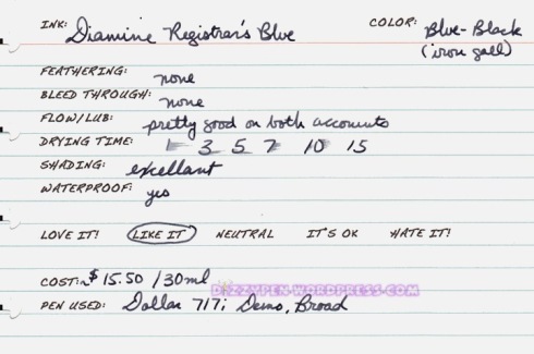
Up today is Diamine Registrar’s Blue. This is one of very few Iron Gall inks on the market. I have previously reviewed two other iron gall inks: R&K Salix and R&K Scaboisa.

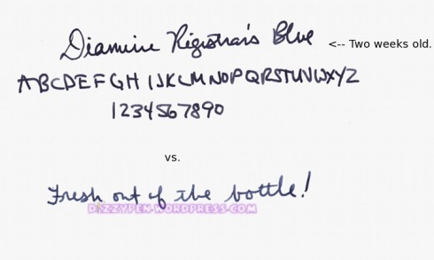
Iron gall inks have been in existence for many hundreds of years, but most were for dip pens only. However, with the advent of the fountain pen, at the turn of the last century, came fountain pen safe iron gall inks as well. Iron gall inks are waterproof, and have been proven to stand the test of time despite their acidic nature (can eat through some papers over the course of several decades). Diamine Registrar’s Blue is a fountain pen safe traditional blue-black. It goes down blue and quickly begins to color shift to a very dark almost black sort of color. Here is a picture of the color shift:

(click to sharpen and enlarge the images)

When I first attempted to use this ink I experienced a near immediate clog. When I filled my pen, I had dipped it all the way to the bottom of the bottle. Iron gall inks tend to have a lot of sediment in comparison to  conventional modern fountain pen inks, so I likely sucked some of that sediment into the pen. I flushed the pen without much difficulty, and filled it again with this time not dipping the pen too deep into the bottle. The second time worked out just fine, and I had no clogs. This potential for sediment and the acidity of the ink put iron gall inks in the high maintenance category. In my opinion, this ink is worth the extra effort.


The Details:

  • No feathering or bleeding. This ink performs admirably on poorer quality papers.
  • Flow and lubrication are pretty good, but iron gall inks tend to run a bit dry. This ink is no exception.
  • Drying time is a bit long with a wet writing pen.
  • Excellent shading.
  • 100% waterproof!


This ink was sent to me for review by the good folks at Diamine Ink Co. I am not otherwise affiliated with them.

PS: I just wanted to thank everyone for their thoughts and prays. I have made it back from my trip to see my grandpa. He is stable, but not doing well at all. I’m just glad I got a chance to spend some time with him before it was too late.

Noodler’s Bluenose Bear, A detailed review

10 Aug

I want to start this off by saying that I am an incurable Noodler’s ink fan. I believe the company, with very few exceptions, makes inks that make the everyday usage of fountain pens possible. The wide array of colors, fraud/water resistant specialty inks, and constant innovation are invaluable. I honestly, don’t know where our hobby would be without Noodler’s ink. I will forever be a fan.

Having said that, I must admit that I am terribly disappointed in Nathan’s latest creation , The Bluenose Bear. Perhaps this ink is a victim of misdirected marketing or over-hype. At particular issue here is the claim of a lighter, brighter blue outline/halo around your line when you use a flex pen. Nathan has been hinting at creating such a novelty ink for a couple years now. I, for one, have been eagerly awaiting its debut. Unfortunately, that feature is inconsistent at best and unattractive at worst.

On the other hand, Bluenose bear is quite a nice blue-black color with a bit of a green hue. The color of the ink itself is very similar to Noodler’s Coral Seas, an Australian exclusive ink. The “outline” is a much brighter turquoise sort of blue.

The Condensed Details (with explanations to follow):

  • This ink exhibits some of the worst feathering and bleeding I’ve seen in a Noodler’s ink.
  • The flow and lubrication are average.
  • This ink is very fast drying
  • The shading is excellent. The ink produces a bright blue outline/halo where the line is the most saturated.
  • This ink is not 100% waterproof, but there is a grey component that remains on the page.

(click to enlarge and sharpen the images below)

Now let’s get into a bit more detail:

Feathering

While I had high hopes for this ink, I have to admit that I was concerned that the blue halo might look a bit too much like feathering for my tastes. Unfortunately, I was right. The bright blue component of this ink behaves quite poorly. Presumably, this is what makes the halo effect possible. On certain papers, the bright blue component separates from and spreads out beyond the blue-black line thus giving the impression of an outline/halo. The outline is by no means smooth. It is jagged like one would expect from feathering. It is also inconsistent. It jumps out here or there depending on the amount of ink put down.

Below are two samples of the “halo”. “Xerox” is written on 24# Xerox multi-purpose paper. This is typical office paper stock. This paper is generally quite fountain pen friendly, but it seems to bring out the worst in Bluenose, and, consequently, displays the halo best. “Rhodia” is written on a Dot Pad. Bluenose is better behaved there while still showing some halo.

Bleeding

That same bright blue component of the ink tends to bleed if enough of it is put down on the page. When I say bleed I do mean bleed. In some cases, it will go through to the next page. Here, again, are the words “Xerox” and “Rhodia”.  I am also including a full scan of the back of two office papers sheets. As you can see, the bleeding is awful on the office paper, but tolerable on the Rhodia. However, it should be noted that it is very difficult to get an ink to bleed through (or feather) on Rhodia paper. This ought to give you an idea of how pervasive the problem is.

Flow and Lubrication

The flow is good to average. I’m still getting used to the flex pen, so I had some railroading issues in some of the samples. That was my fault not the ink’s. Lubrication is also average. The flex nib is quite scratchy at times. That is the nib’s issue, but it would be nice if the ink has more lubricant qualities to help smooth the nib out a bit.

Drying time

Bluenose dries almost as soon as it hits the page. This was true of all the papers I tested.

Shading

Now, the shading of this ink is phenomenal, but with it can come feathering and bleeding. If you use high quality heavier papers (like the Clairfontaine Graf It pad or Crane’s Choice) and a juicy stub italic nib you can get some truly amazing shading with minimal feathering and bleed through. If you are an artist, I’m sure you could achieve wonderful results with a brush pen.

Waterproofness

I need to do some further testing, but I’d place this ink in the near bulletproof category. The blue-black color washes away, the bright blue fades and spreads, but a grey line remains.

Other considerations

Perhaps this ink is better suited for the artist rather than the conventional fountain pen user. As Nathan promises, this ink does glow when used on IVORY paper and viewed under a black light. The ink also shows some interesting variations when swabbed that might yield interesting result if used with a brush pen.

All in all, I am not happy with this ink. I have no intention of buying a bottle of it. It is just too ill-behaved to use for writing. If you are like me and you can’t abide feathering and bleeding you might seek out the aforementioned Australian Noodler’s Coral Seas as a suitable substitute. However, note that it is whopping $32.

Below are more writing samples. I wrote on the following papers using a Noodler’s Flex pen and a Lamy Vista fitted with a 1.1mm Italic nib: Xerox 24#, HP LaserJet 24#, Clairfontaine Graf It 90g, Rhodia Dot Pad, Crane’s Choice 90g, American Stationery Business Monarch in Ivory, Tops 3 x 5 blank index card, and Tops 4×6 lined index card.

No Affil.

Rohrer & Klingner Salix, Iron Gall Ink

20 Oct

Iron Gall inks are quite interesting. They are made from Iron Gall Nuts, which come from Oak trees. Here is a quick Wiki on Iron Gall ink. These types of inks were basically the standard prior to the advent of the fountain pen, and even through out the better part of the last century, blue-black inks were often made, at least in part, from iron gall.

Straight iron gall ink can be corrosive to fountain pens, so it is only used with dip pens. There are, however, several modern iron gall inks that are quite fountain pen friendly: R&K Scaboisa (purple not blue-black), R&K Salix, Diamine Registrar’s Ink, Mont Blanc Blue Black (bottle form only), and Lamy Blue-Black (bottle form only). Most other modern blue-black inks or going to be your average dye or pigment based ink.

You should know that Iron Gall inks are considered high maintenance. You are going to want to flush your pens more often than not and watch for clogs if the ink starts to evaporate some. You also want to be very careful when trying to mix these inks with regular FP inks. There are a few traits that can help you distinguish an iron gall ink from a standard ink. Firstly, it is going to feel dry on the page even if the flow is good. Secondly, it is going to go down a lighter version of itself and darken towards black, grey, or brown over time. Third, it is going to be waterproof when dry.

That waterproof aspect is what made me want to try R&K Salix. A lot of my work involves drafting and taking notes for my dissertation. I do all my first drafts by hand. It makes me much more comfortable knowing that my works will survive a spill. There is a story behind this. In short, a couple years ago I had a bottle of water in my bag, and unbeknownst to me the cap had worked its way off. By the time I noticed, water had gotten all over my binder, and I’d lost a semester’s worth of notes. From that point on, I’ve only used bulletproof, eternal, waterproof, and water-resistant inks for my notes.

R&K Salix is a bit of a departure from Diamine Registrar’s ink or Mont Blanc Blue-Black in that it stays mostly blue even after the color change. The end result is a nice blue gray not unlike Diamine Prussian Blue.


The Details

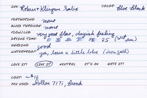
  • No feathering or bleeding even on cheap copy paper. This is definitely a good choice if you have to use poor quality paper for work or other situations.
  • Good flow, but feels very dry on the page. This ink is still very usable, but it is not lubricating.
  • The drying time for this ink was slow at 25 seconds on this note card and 20 seconds on HP LaserJet 24# paper. This may have been because of the wet writing pen I used, but either way it is slower than you average ink. Lefties take note.
  • Saturation is low to moderate even after the color change.
  • Shading is decent.
  • This ink is waterproof. You will lose the slightest bit of blue when wet, but not enough to cause any problems.

(Click to enlarge and sharpen the image)


This sample was sent to me for review by Ryan at Pear Tree Pens. I am not otherwise affiliated with them.

Noodler’s Navy

30 Jul

[tweetmeme source=”dizzypen” only_single=false https://dizzypen.wordpress.com%5D

This is Noodler’s review 3 of 3 for this week.

I never even planned to try this ink, but that all changed when I received a letter written with it. Now, I’m sure it had something to do with the letter writer’s amazing handwriting, but I really fell for this shade. See, I like blues, but I love them even more if there is a hint of green to them. Noodler’s Navy is just that: Navy. It is a dark blue with a touch of green.

It is very well behaved. I’ve had it in a Pilot Petit 1 for at least 3 weeks straight, and it is still going strong. I carry that little Petit 1 with me everywhere. I use it to sign receipts, jot down quick notes, or anything else that requires a pen. This ink performs admirably even on less than stellar paper.

The Details:

  • No feathering or bleed through. Even in poor quality papers.
  • Good flow and even better lubrication.
  • Fast drying at under 5 seconds.
  • There is a little shading depending on the nib, paper, etc.
  • This ink is not waterproof, but it is VERY water resistance. The blue rinses away, but a blackish line remains. It is very easily legible.

(click to enlarge the photo)

No Affil.

Share

Noodler’s Legal Lapis

28 Jul

[tweetmeme source=”dizzypen” only_single=false https://dizzypen.wordpress.com%5D

It’s Noodler’s week here at The Dizzy Pen, so here is Noodler’s review 2 of 3: Noodler’s Legal Lapis.

For months and months I’ve seen folks on FPN raving about this ink. I’ve seen it described as the best Noodler’s ink on the market and the best bulletproof ink available second only to Noodler’s Black. I’ve seen the color described as a blue-black and a teal ink. On both accounts I’m largely undecided.

I like this ink, but I don’t love it. It’s very good and well-behaved to be sure, but it’s not in a color range that I prefer. It’s definitely a blue-black of one sort or another, but there is a green or teal undertone to it. It doesn’t seem very pronounced, but it is there.

Here are the details:

  • No feathering or bleed through.
  • Some minor nib creep.
  • The flow and lubrication is very good on both accounts. This is definitely a smooth writing ink.
  • It dries pretty quickly at about 5 seconds.
  • The shading is PHENOMENAL especially if you are a printer.
  • This ink is bulletproof. It stands up very well to water.

(click to enlarge this image)

This ink is a Noodler’s exclusive made for Pendemonium. It’s a little more pricey than other Noodler’s inks at $18.50 for 3 oz. You can find more info about this ink including water tests if you click here.

No affil.

Share

Visconti Blue

18 Feb

I can’t believe I haven’t put this review up yet. Visconti Blue is HANDS DOWN my favorite straight blue ink. It is one of only 2 inks in my collection that I will replace once this bottle is used up. Fantastic.

The details:

  • Visconti Blue is a Medium Dark straight blue. It does not lean green or red or anything else. It’s just blue. What sets it apart is the vibrancy of it. It jumps off the page at you, but not enough to be offensive. I see this is the perfect professional ink.
  • There is no bleeding or feathering. It actually performs fairly well on cheap copy paper, which is always a plus.
  • Flow and lubrication of this ink is just perfection so far as I am concerned. All of my pens love this ink. Very wet writing and saturated.
  • The drying time is also a bit better than average at just under 5 secs. I’ve never had any smudging issue with it.
  • You aren’t really going to find any shading here, but for this ink I don’t care.
  • It stands up pretty well to the odd water spill (speaking from experience there :headsmack:). The writing remains quite legible though some of the blue does wash away.

All in all this is a fantastic blue and a mainstay in my collection.

Vis Blue Card

No Affil.

Noodler’s Bad Blue Heron

17 Nov

It’s been a while since I’ve done a review, but I’ve been swamped with work. It takes time to put these things together; time I have not had of late. HOWEVER, since I was able to get my hands on a bottle of Noodler’s Bad Blue Heron, I thought I might as well put a review up.

I bought this ink because a. someone on FPN described it as looking like the Crayola Cerulean crayon and that was always my favorite color in the box b. this is a darker bulletproof ink and I’ve been looking for one of those. I have not been disappointed.

Firstly the color. This ink does look a bit like Cerulean crayons when it is wet, but it dries to a very attractive dark blue with hints of green and maybe turquoise. It might even be described as a blue-black. It’s difficult to capture the color of this ink in pictures, but I’ve done my best.

Pros:
No feathering
No Bleed through
Excellent flow
Good lubrication
Some good shading depending on your nib and paper
It’s not just bulletproof, it’s part of the Warden Ink series. It is the most fraud resistant ink available. (see comp. below)
Comes in a 3 oz. bottle
No nib creep.

Cons:
It has that trademark chemical odor that can down right knock you over if you sniff the bottle.
It sticks to the nib and can be a pain to clean off.

Now about this sticking business. This was a bit off putting at first. When I first got the bottle I dip tested it with a dip pen. This ink dried on the dip pen nib and it was really hard to wipe off. This made me nervous. So, I put it in a Sheaffer’s Cartridge pen. I did not have the same sticking problem. After having it in that pen for a few days I switched it over to my Levenger Plumpster. I didn’t have any problems rinsing the Sheaffer clean, and I can’t find any evidence of ink still stuck on the nib. It’s been in the Plumpster for several days now and I haven’t had any problems at all. No clogging, no nothing. It also is not sticking to or staining the walls of the cartridge I put it in. So, I’m confident that this ink is perfectly pen safe.

My one suggestion would be to fill the pen using a syringe or some other method so you don’t have to dip the nib in the ink. This makes for easier clean up. But either way you should be fine. I also recommend that you flush you pen every one to two fills of this ink. Good pen hygiene=happy pens!

Further Note: When I write a review of an ink I strive to provide the most accurate account of my experiences as possible. My comments about the ink sticking to the dip pen nib should not be misconstrued as a denunciation of this ink. I, in fact, love it and it will likely see heavy rotation in my pens. For some reason, that is beyond my understanding, people tend to have a visceral kind of reaction to Noodler’s ink as if it is the devil or something. I am not one of those who subscribes to that sort of nonsense. I have several bottles of Noodler’s ink, including two other bulletproof inks, and I use them without reservation!

Now for the pictures:

ND Heron

Here is a comparison for reference:

ND heron comp

Here are a set of swabs meant to test this ink’s bulletproofness. This test was performed on 24# copy paper. As you can see A little of the blue dye is lifted when it come in contact with liquid; otherwise, this ink isn’t going anywhere. I got a little carried away with the soapy water test and actually did remove some of the paper. The ink is still there!

ND Heron tests

No affil.

Thistle Company Blue-Black

2 Oct

This is my workhorse ink. I use it to write drafts and to take notes in class. It is amazingly well-behaved even on the cheapest of papers. This is mixed at 3x strength. One packet gave me about 10 oz.

A few main points:
No feathering
No bleed through
No smearing
Dry in about 4 seconds
Medium flow: not too dry and not too wet.
Amazing shading!

Thistle BB Card

No Affil.

Levenger Cobalt Blue

2 Oct

I just filled my Estie with this ink and thought I might as well post a review of it. I know that there have been some disparaging remarks about this ink on the forums, but I happen to like it quite a bit. It’s a nice rich dark blue. It’s hue is true to its name; it reminds me most of cobalt colored glass. It does have a couple drawback: it feathers on poorer quality paper and will smear on coated papers like some of the laser jet papers.

I will say that it stained one of my pens, but I’m inclined to blame the pen rather than the ink. It is one of those Chinese squeeze filler pens. The clear sac is now blue tinted, but this is the only staining I have seen. I have put this ink through every pen I own and it has not stained any other pens or converters and it is not terribly difficult to wash out of a pen.

The info:
Will feather on poorer quality papers
Will bleed through a little bit on poorer papers and a lot on thinner papers, but is just fine on good quality papers like Rhodia etc.
It flows readily and lubricates well.
It has a measure of water resistance, but not much.
Heavily saturated; may stain clear sacs

I happen to like the way this ink looks on ivory paper:

No Affil.