Tag Archives: Brown

Diamine Chocolate Brown

16 Sep

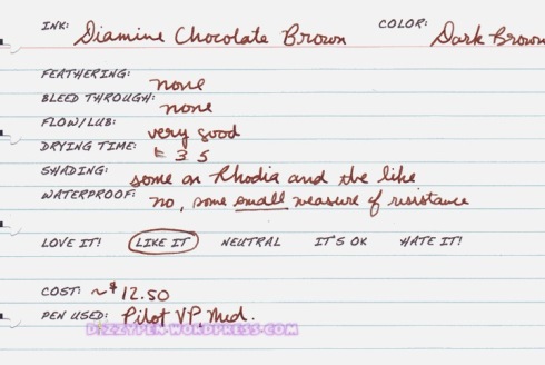
My attraction to brown inks is a fairly recent one. I used to detest them. Why? I’m not really sure. I suppose I just built up a sort of brown ink block. Boy have things changed now. I recently reviewed Diamine Saddle Brown, it is one of my favorite brown inks. Well, Diamine Chocolate Brown is my second favorite Diamine brown ink and probably one of my all time favorite browns, up there with Caran d’Ache Grand Canyon Brown and Noodler’s #41 Brown (old formula). Now, I generally don’t care for browns that lean toward another color. Chocolate Brown, like milk chocolate leans a little toward red. It is subtle enough to not bother me, but not so subtle that you can’t notice that there is just a little something different about Diamine Chocolate Brown. This is definitely a good dark brown ink.

The Details:

  • No feathering or bleeding.
  • Very good flow and lubrication.
  • Fast drying time.
  • Some shading on coated papers.
  • Not waterproof and really not very water-resistant either

(click to enlarge and sharpen the image)

This ink was sent to me for review by the good folks at Diamine Ink Co. I am not otherwise affiliated with them.

Diamine Saddle Brown

22 Aug

Hello all! I just got a new monitor. I’ve been messing around with the color calibration. I think I’ve got it right, but I’m not all the way sure. If my scans start looking really off please let me know. This has been really frustrating!

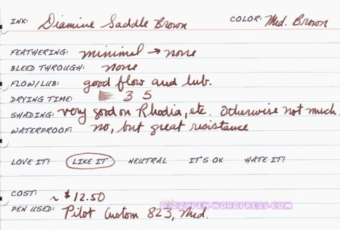
Up today is Diamine Saddle Brown. This is one of my favorite brown inks. To me, it is a true medium brown with very slight reddish undertones. It doesn’t lean heavily one direction or the other. It’s also quite well-behaved with a little water resistance as well.

This is the ink I chose for my first fill of my newest pen: the Pilot Custom 823 in Amber with a Medium nib. These two inks love each other!

The Details:

  • Minimal to no feathering depending on the paper.
  • No bleeding.
  • Good flow and lubrication.
  • Average drying time at 5ish seconds.
  • Very good shading on coated papers like Rhodia. Otherwise, there isn’t a whole lot of shading.
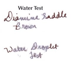
  • Not waterproof, but it is resistant. See image below.

(click to sharpen and enlarge the image)

This ink was sent to me for review by the good folks at Diamine. I am not otherwise affiliated with them.

Swabs of New Platinum Mix Free Inks

1 Aug

(click to enlarge and sharpen the image)

I just received my 9 super samples of the new Platinum Mix Free line. I thought you all might want to see the swabs. I haven’t played around with the inks yet, but I will definitely put up some reviews as soon as I have formed opinions of them.

Initial Thoughts:

  • Smoke Black is a rather average black.
  • Earth Brown is a reddish-brown. It is very similar to J. Herbin Cafe des Iles.
  • Aurora Blue is one of my favorite. It is very similar to Diamine Sapphire Blue.
  • Aqua Blue is a nice turquoise blue. It is very similar to J. Herbin Blue Prevenche.
  • Leaf Green is also a nice green color. It reminds me a bit of J. Herbin Lierre Sauvage.
  • Silky Purple is definitely my favorite color of all these, and it is nearly identical to J. Herbin Rose Cyclamen. It’s very bright and a very red purple.
  • Cyclamen Pink is nearly identical to the long since discontinued Levenger Pinkly.
  • Flame Red is nearly identical to Noodler’s Dragon’s Napalm.
  • Sunny Yellow is a fantastically rich yellow.

Sample Kit retailers:

  • ISellPens.com sells a sampler for $20. In their kit you get a 10ml sample of each 9 colors of Mix Free inks, 2 extra bottles, and 2 ink syringes. This is where I purchased my kit.
  • GouletPens.com sells a sampler for $30. In their kit you get a 5ml sample of each of the 9 Platinum Mix-Free fountain pen ink colors in labeled plastic vials, a Goulet ink syringe set, and ten empty ink vials.
  • PearTreePens.com sells a sampler for $29.95. In their kit you get one 5mL sample of each of the 9 specially designed colors, one Write-Fill Kit, an empty full-sized ink bottle (of their choice), and three empty sample bottles.

There are several places you can get full bottles of Platinum Mix Free inks. Individual bottles are around $20 each. Many places are selling full-sized sets of all 9 inks for $149.

Happy mixing!

No Affil.

J. Herbin Café des Iles

22 Jul

This is the last review in the FPN member Alecgold review series.

While I really love J. Herbin inks, I really dislike this one. It is one of the weakest/lowest saturated inks I’ve used from them. I’d describe this color has a brown with reddish undertones.

I prefer much bolder colors than this. Still, it has all the wonderful characteristics of a JH ink. So long as you don’t mind low color pay off, you might quite like this ink.

The Details:

  • Little to no feathering
  • No bleeding
  • Good flow and Lubrication
  • Fast to average drying time
  • Very good shading with the right pen/paper combo
  • Not waterproof and very little water resistance

(click to enlarge and sharpen these images)

Alec Review 6/6. No affil.


Iroshizuku Tsukushi v Mont Blanc Toffee Brown

30 Aug

Up today is Iroshizuku Tsukushi (IT) and MB Toffee Brown (TB). I have to admit that I had very limited interest in trying Tsukushi until a friend of mine offered to give me a sample. In general, I’m not a fan of red browns, and all the scans I’d seen online showed a very red component to IT. I much prefer a straight brown like CdA Grand Canyon or Noodler’s #41 Brown. Once I’d tried IT I found it to be a cool toned medium saturated brown with an understated red component.

I actually stumbled upon TB as a Tsukushi substitute while at lunch with an FPN friend of mine. She had a pen filled with IT and I had one filled with TB. It was actually a bit difficult to tell the two apart. There are some differences though.

MB Toffee Brown is

Darker that IT
Higher saturated than IT
a little more red than IT
warmer/more golden than IT

Although the swabs highlight the differences between these two inks, if you take a look at the writing samples you can see a bit more of the similarity.

(click to enlarge and sharpen the images)


Another possible alternative to Tsukushi is De Atramentis Sepiabraun, however, I haven’t had to chance to try De Atramentis Sepiabraun, so I can’t really comment on how close it actually is.

If you have another suggestion for an alternative to IT please leave a comment below!

Disclaimer: The goal of these reviews is to find inks that are similar in color and behavior to the Iroshizuku line but at a lower price point. This should not be construed as an attempt to find exact replicas. That is not possible. The Iroshizuku inks succeed at being unique. The only way you can get an exact match is to save up for the Iroshizuku. Whether or not these suggestions work for you is entirely up to you.

No Affil.

Iroshizuku Yama Guri vs. Caran d’Ache Grand Canyon Brown?

18 Aug

[tweetmeme source=”dizzypen” only_single=false https://dizzypen.wordpress.com%5D

Firstly, let me apologize for how long it is taking for me to get these reviews/comparisons up. I intended to do 3 a week, but they have turned out to be a lot more work than I bargained for. In addition, I’ve had some unexpected health distractions come up, so I’ve been away from the blog for about a week. I’m also in the middle of a move, so I’m going between two places that are 3 hours apart. I’m presently stuck at one of those places while all my review materials are at another place! This set of scans is the only set I have on this computer, so it’s probably going to be next week until I can start getting the other Iroshizuku reviews up. As if that weren’t enough, I’m a grad student, and I’ve got grad work that is taking a lot of time right now. I’m so sorry about this, but sometimes life just happens, and it’s happening to me at an astonishing rate!

Now for the review/comparison:

Iroshizuku Yama Guri (YG) and CdA Grand Canyon (GC) are the two browns that are responsible for my present love affair with brown ink. Now, you might be saying to yourself that these two inks are quite different. Well, yes they are, but hear me out! I still think GC can be a wonderful alternative to YG. Sure, there are inks that are a little closer in color, but they don’t come close to Iroshi’s behavior characteristics. CdA inks are some of the only inks that can go toe to toe with Iroshizuku behavior. It’s the behavior similarities that make GC the perfect alternative for me.

Yama Guri is

a dark cool brown that can have a sort of green sheen/tint to it in a wet writer
It doesn’t shade much

Grand Canyon is

A warmer brown with some golden undertones
It is not as dark as YG
It exhibits phenomenal shading

Here’s the thing though, if I’m honest, I actually like Grand Canyon Brown more than Yama Guri. Yes YG is a wonderful ink, yes the behavior is fabulous, but there is still something missing for me. GC has that something I’m looking for. What’s more, GC is every bit as well behaved.

(click to enlarge and sharpen the photos)

Other alternatives:
Rohrer & Klingner Sepia: Darker, not as well behaved
Noodler’s #41 Brown: not as well behaved, bullet proof
Diamine Saddle Brown (maybe): a little less saturated

Disclaimer: The goal of these reviews is to find inks that are similar in color and behavior to the Iroshizuku line but at a lower price point. This should not be construed as an attempt to find exact replicas. That is not possible. The Iroshizuku inks succeed at being unique. The only way you can get an exact match is to save up for the Iroshizuku. Whether or not these suggestions work for you is entirely up to you.

ETA 06/28/2011:

At their retail prices both are approximately $1.67 per ml. However, in terms of initial upfront cost the Caran d’Ache is more affordable even though you pay the same price per ml in the end. At the end of the review I list other inks that come pretty close to Yama Guri at a much lower price per ml.

But, honestly, I’m never going to get through 50ml of this ink. I have SO many bottles/samples of inks and several other browns. I can’t even hope to get through 30ml of it, so that makes the price per ml even less relevant for me. So if, like me, you are more concerned with the upfront cost as opposed to the cost per ml, then Caran d’Ache is a good alternative.

No Affil.

Share

Noodler’s #41 Brown

20 Jul

[tweetmeme source=”dizzypen” only_single=false https://dizzypen.wordpress.com%5D

I’ve always liked the color brown. As a matter of fact, Chocolate Brown was one of my wedding colors. The thing is, I never saw brown as an attractive ink for writing. It just seemed a bit too drab for me. I usually prefer bright blues and purples. However, I have recently become absolutely enraptured by brown inks. It all started with MB Toffee Brown, and it’s pretty much been all go since then.

Noodler’s #41 Brown is one of my absolute favorite inks, and my favorite brown ink, along with MB Toffee Brown of course. It is a rich and deep dark brown. There is a certain warmth about it, but I don’t really see it leaning toward any other color. It’s just dark brown, and a bulletproof one at that!

The Details:

This ink is amazingly well-behaved.

  • There is no feathering or bleed through.
  • The flow and lubrication are simply amazing.
  • The drying time is a bit slow, but not terrible at 10 seconds.
  • It actually manages to shade a little depending on the paper.
  • It’s bulletproof! In the water test I had a little ink run off, but it was only in the areas where the ink could not bind with the cellulose. That Plumpster is a rather wet writer.
  • For a bulletproof ink, the smell isn’t as chemically as most of the others.

***Now, a word about the writing samples. I just got a new All-in-One printer. It has a very good scanner. The pictures below are my first scanned writing samples. They were scanned at 600dpi. Please let me know what you think. I quite like the results.***

ND 41 Brown Card

Since I’ve got a scanner I can also include the review sheet. I actually have one of these for every ink I’ve reviewed, I just could never get a good picture of it. Click it to view a larger size.

ND 41 Brown Sheet

No Affil.

Share

Mont Blanc Toffee Brown Review and the Elizabeth I

9 Jun

[tweetmeme source=”dizzypen” only_single=false https://dizzypen.wordpress.com%5D

Photo from Wheelers

I don’t often get a chance to stop by the MB Boutique, but I was able to get over there on Monday. The man at the front desk was very friendly and helpful. I went in knowing I wanted the Toffee Brown or the Lavender Purple. They didn’t have LP so TB it was.

The salesman allowed me to use a MB146 with a medium nib to  dip test the ink  before I bought it. I immediately fell in love with it. Now it should be noted that I’m not really a “brown ink kind of person”. I generally don’t care for brown inks with the exception of R&K Sepia and JH Cacao du Bresil, but this one just sang to me.

This ink is true to it’s name. It looks a bit like homemade toffee. It’s a rich medium brown with yellow and red undertones. It’s well behaved as all MB inks are, and the bottle is super functional (click the above picture for more photos of the bottle and packaging).

The details:

  • No feathering or bleeding
  • Flow and Lubrication is average: not too wet and not too dry.
  • Average drying time at about 7 seconds on several papers including Rhodia/Clairefontaine
  • The shading is magnificent especially with a soft nib like this 18k medium VP
  • There is absolutely no water resistance whatsoever. Klutzes beware!

MBToffeeBrownCard

MBTBonivory

While I was at the boutique the salesman allowed me to handle fondle the Red Mont Blanc Elizabeth 1 (limited to 888 pens). Let me just say that the pictures don’t even come close to the beauty of this pen! The size, weigh, fit and finish are just spectacular. If only I could afford the several thousand dollars it would take to buy one…

From the MB website

Here are the specs from the MB website:

Introduction: May 2010
Limited to: 888 fountain pens

  • Body and cap of solid 750 rose gold, coated with crimson transparent lacquer and decorated with the Tudor rose
  • Body and cap, even underneath the transparent lacquer, decorated with ornaments recalling the binding of the book “The Miroir or Glasse of the Synneful Soul”.
  • Rose gold clip with a princess-cut green garnet (~0.21 ct.)
  • Hand made 18 K rose gold nib with engraved royal crown motif

If you get a chance to look one over you should!

No Affil.

J. Herbin Cacao du Bresil

5 Mar

I really was never a brown ink kind of person. It is not until recently that I’ve come into the fold so to speak, but even so, I really dislike brown inks that lean red, green, or yellow. I want an ink that is a dark brown that maybe leans a bit black or gray. Thus, it was love at first sight for JH Cacao Du Bresil. It’s gray yet brown or rather brown yet gray!

The Details:

  • I’d describe this color as a medium-darkish brown ink that heavily leans gray. It really needs a wet writer to strut its stuff. In a dry writer it will simple look light gray.
  • There is not bleeding or feathering.
  • The shading is phenomenal.
  • It dries relatively quickly.
  • Waterproof? No, but the resistance is very good indeed.

JHCDB

No Affil.