Tag Archives: edison

Edison Mina

20 Jul

Up for review today is the Edison Mina in both the standard and extended versions.

First Impressions

This is a truly gorgeous design. My mother was with me when I opened the box and we both oohed and ahhed at the sight of these pens, especially the extended version in the black rose acrylic. This is definitely one of those designs that will turn heads especially if you choose the right material for the job.

Appearance

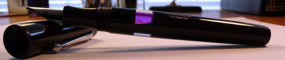
Top to bottom: Edison Mina extended, Glenmont, and Mina standard

The regular Mina was sent to me in black acrylic. The black material shows off the design of the pen, but it doesn’t pop. The extended Mina came to me in the Black Rose acrylic. This material is just about perfect. The subdued swirl sets off the subtle curve of these pens, the the material does not overpower the design.

Design/Size/Weight

The design of this pen is quite wonderful if subtle. There is a subtle flare at either end that makes the pen un-postable. At the same time, that flare makes for a very well-balances comfortable feel in hand. Despite the extra material at the back, this pen is not back heavy. Both the extended and regular Mina feel comfortable to me, but the extended is the more comfortable of the two. I do have largish hands for a woman, so that probably explains it.

Although this pen is being marketed as a ladies pen for someone who likes slimmer sections, the overall feel of the pen is similar to that of other Brian Gray pens. It feels substantial in the hand. The slimness of the pen is only evident in the section design, which feels significantly less girth-y than my Edison Glenmont.

As mentioned above, you cannot post the cap. This model is also clipless. The flare design does make this pen somewhat more prone to rolling. You’ll want to be careful when setting the pen down. Brian does offer a pen rest (purchased separately) to help guard against accidents.

These are the dimension for the two pens from Brian’s website:

Standard     Extended

Weight w/ Cap           20 grams     23 grams
Weight w/o Cap          14 grams     16 grams
Diameter at thickest         .596″     .596″
Diameter at thinnest        .520″     .520″
Length Capped                 5 1/4″     6″
Length Uncapped            4 3/4″     5 1/4″

Top to Bottom: Edison Glenmont, Mina extended, Lamy Vista, Mina Standard, and Pilot Prera

Nib

The nib for this model is different from the others Brian offers. They are a smaller size. Whereas his other pens are #6 sized nibs, the Mina pens have #5 sized nibs. This is part of what allows Brian to slim down the section.

The nibs are available in 18k gold or steel. The 18k nibs come in standard sizes of Fine, Medium, and Broad. The Steel nibs come in the same standard sizes as well as stub italic sizes of 1.1mm, 1.5mm, 1.9mm and 2.3mm. As always, Brian will make custom nibs for an additional fee.

One of my pens came with an 18k Fine nib and the other came with a 1.5mm steel nib. The 18k Fine is a smooth wet writing nib with just enough tooth to keep the pen under control. The 1.5mm steel nib is quite smooth with the same amount of tooth. However, it is not quite as wet writing as the 18k fine, but I would not characterize it as dry either; it has average flow.

I’ll just mention again with Brian can and will do custom grinds for a fee and will generally adjust smoothness and flow free of charge.

Filling System

The Mina comes standard with a cartridge/converter filling system. It takes the standard international sized C/C.

You can also use your Mina as an Eyedropper filler. These are not my pens, so I did not do this, but the conversions appear to be quite simple. All you need is a little silicone grease and you should be in business. The barrels seem quite cavernous. I’d guess they hold in excess of 2ml of ink.

You can also get this model with a Bulb Filler for an additional fee. My Edison Glenmont is a bulb-filler. I love that system. It is simple yet efficient. I highly recommend this system.

Cost and Value

The Mina is slightly less expensive than Brian’s other models. It is priced at $200 for a steel nib, and $300 for an 18k nib. The bulb filling system is an additional $100. Nib customization ranges from $20-$65 depending on what you want done.

I think this is an excellent value for the quality of these pens and the time and care taken to make them.

*Note: Brian only charges $65 for custom flex grinds!

Conclusion (9/10, A-)

All in all, I think this is a fantastic addition to Brian’s line. The pen is beautiful, and comfortable in the hand. It offers a slimmer section for those with smaller hands, but the section is not so slim as to be uncomfortable for those with larger hands (such as myself).

This slideshow requires JavaScript.

These pens were sent to me for review by Brian at the Edison Pen Co. They were not given to me; they were only a loan. I have since returned them. I was offered a discount if I chose to keep one of them. I declined the offer. I am not otherwise affiliated with Edison Pen Co. or Brian Gray.

My Writing Arsenal *Updated*

9 Dec

In February I put up a blog post about my arsenal. That is the list of the items in my accumulation that I could not live without. Needless to say, my opinions have changed with my collection. In addition, as I get deeper and deeper into my school work, my needs have changed tremendously. So, it’s time for a bit of an update (OK, more than a bit of an update. This is a long post. You’ve been forewarned!)

Pens:  Pilot VP, Pilot Custom 823, Pilot Prera, TWSBI Diamond 530, Edison Glenmont

Until I started this posted I had not realized just how much I use and rely on my Pilot pens. I would have never described myself as a Pilot fan, but I guess this makes me one doesn’t it?

The VP remains the perfect note-taking pen. The click/retractable nib mechanism makes it perfectly suited for jotting down quick notes in a meeting or when on the go.

I purchased the 823 (review forthcoming) specifically for use in drafting my long papers, articles, and chapters. It is really perfect for that task. It holds over 2ml of ink when I use my Visconti Inkpot (review forthcoming) to fill it. The Broad nib is juicy and smooth which makes writing fun while also forcing me to slow down.

My little Brown Prera (review forthcoming) is my editing, grading, and marginalia pen. It’s super fine and smooth nib makes it perfectly fit for that purpose. It’s also a comfortable little pen.

The TWSBI was also purchased with long writing sessions in mind. Boy is it a winner! I love that thing. I use it most everyday.

My Glenmont remains a favorite especially for letter writing, but then I designed it myself, so why wouldn’t it be?

The Stipula Vedo and Levenger Plumpster have fallen off the list. I still like them quite a bit, but as my workload has changed so have my writing instrument needs. The Vedo’s nib is a bit too sharp for long writing sessions and the Plumpster lacks the ink capacity I need for lots and lots of writing.

Inks: Noodler’s Navy, Noodler’s #41 Brown, J. Herbin Poussiere de Lune

Noodler’s Navy has become my workhorse ink. It’s near-bulletproof, so I don’t have to fear for my writing’s longevity. It’s an unassuming and relatively nondescript dark blue, so it’s not at all distracting. It’s extremely well-behaved no matter what I throw at it. To me, this is the definition of workhorse. I’m seriously considering ordering a 16 ounce bottle of the stuff… maybe I should make that 32 ounces just to be on the safe side?

Noodler’s #41 Brown is a great dark brown. It’s very well-behaved and bulletproof to boot. I’m entering a phase in my writing where I need to know that it will survive the odd spill (I’ve got a story behind this, but that is for another time).#41 accomplished this goal while still being nice to look at.

I love purple inks, so it’s only right that one be on this list. Poussiere de Lune is just the ticket. I have a lot of purple inks, but this is one of my favorites. It also has a good measure of water resistance. That is a must.

Visconti Blue has fallen off the list, but I still believe it belongs in every ink collection. It is the perfect medium dark blue to me. It is exceedingly well-behaved, and it is vibrant enough to set you part from the crowd while still maintaining its professional air. The only problem for me is that it offers absolutely no water resistance. It this point, water resistance is non-negotiable.

MB Violet has fallen off this list as well. I still love it and it still holds all the sentimental value it did before, but I just don’t use it as much as I used to.

Journals: I still haven’t found “the one.” I do still use and quite like my Exacompta Basics sketchbook, but I’m not sure it is the one. I’ve tried and loved the Rhodia Webnotebook, but I haven’t had it and used it long enough to know if it is really “the one.” After I finish the Exacompta, the Webbie is going to become my dedicated journal. We’ll see what happens.

Stationery: American Stationery Business Monarch and Crane’s 90gsm Pearl White

I still use the Business Monarch as much as I did.  I’ve also developed a fondness for the Crane’s paper. Lately, I’ve been using it almost exclusively. My pens and inks love both these papers, and the papers certainly look the part.

Paper for everyday use: HP LaserJet 24lbs.

I simply cannot say enough good things about this paper. All of my pens and inks love it. It is smooth and it resists feathering and bleed through. At $9.99 per ream of 500 sheets it is quite affordable. The local big box office supply stores often run 2 for 1 specials on it, so that’s 1000 sheets for $10. That’s some of the better rates I’ve seen for good quality consistent paper. I go through a lot of this paper, and it does not break the bank. This is always a good thing when it comes to the student budget.

Staple’s Bagasse has fallen off the list. It has become a bit inconsistent, and I’m no longer a fan of its thin crispy feel and lined rule. It also bleeds like crazy.

Planner: This category is presently in flux. I had been using and loving a Quo Vadis Septanote, but I thought I’d do better with a pocket planner. This academic year I’ve switched to the Quo Vadis University. It is quite similar to the Septanote, but it’s pocket-sized. So far so good, but I still need a desk planner I love. I’m trying out the Quo Vadis Principal, but I’m not sure I like it.

Misc.: Circa Desk Punch, Rollabind discs, Large Staples Rolla Notebook

When I made my first arsenal post I speculated that the Circa punch would become a staple. Well, it has in a big big way. I was able to get one of the older versions for $30 from the Levenger Ebay Outlet. That plus Rollabind discs also from Ebay had me all set to punch and organize. Covers were and are, to some extent, an issue. Levenger covers are expensive, so I went on a search for cheap cover options.

While at Staples I noticed a Rolla Notebook. It is, of course, disc bound with a stiff yet padded black faux leather cover. It fits 8.5×11 paper, so it seemed perfect. I got it home, and I tried it out. The paper sucks SUCKS, so I recycled it and refilled the Notebook with my beloved HP LaserJet paper. PERFECTION!!!

———————-

So there you have it. These are the writing products I cannot live without. How about you? What are you using and loving these days?

The Edison Glenmont in Purple Web Celluloid

10 Feb

Let me start this with a bit of a slideshow. One of the great things about ordering a pen from Brian is that you get to watch it being born. As I was watching Brian make my pen, I took some screen shots of the process. I’ve included captions so that you all can figure out what was going on.

I just can’t say enough about how fun it is to watch your pen being made.

Now THE REVIEW:

EGinbox


First Impressions

This pen is everything I thought it would be and more. The material is unsurpassed. I never appreciated the difference between acrylic and celluloid. It is warm to the touch and seems to ‘glow’ for lack of a better word. This pen and material is near impossible to photograph properly, especially with my little Lumix  TZ4 and rigged up lighting setup. I’ve done the best I can do, but please take my word for it when I say this is a material that can only be appreciated in person and in direct sunlight!

Appearance

EGCap

This pen just looks great! As mentioned above, I’ve used a celluloid material. It is Purple Web by American Art Plastics and is a true Celluloid not just acrylic. I find that I quite like the slight camphor smell as I write with it. It’s not overbearing at all. The material itself is a deep purple mauve sort of color. In poor lighting it appears a plain dark plum, but when the sun shines on it it just comes alive. The material has striations in it. These striations are actually translucent, so depending on how thin the pen is turned you can actually see through them. Brian turns his pens rather thickly, so I can only see through the material near the ink window and near the cap threads. It’s a rather nice effect. In addition to the striations, the material also has a bit of silver dust sprinkled through out. This also gives it a bit of a shine.

I’ve included a picture from Brian’s Flickr page that better illustrates this than my photos. Note this is not my pen:

The expert craftsmanship is evident. If one examines the pen closely one can observe the occasional maker’s marks. This is not to say that the pen is flawed. To the contrary, the glossy finish on this pen is superb. The occasional tool mark only adds to the handmade aesthetic of the pen. It’s a bit like observing handmade carpentry (did you know Brian is also a woodworker and does beautiful Marquetry work?). I love it!

Design/Size/Weight

EGpen

The Glenmont design is itself a sight to behold. I love that it recalls the Waterman, Sheaffer, Parker flatops that were so popular in the 20s and 30s. While I love cigar shaped pens as much as the next person there really is just something about those flat tops.

I did make a few alterations to the pen design. Most notably, my pen has no coordinating color end caps. With the material I chose I did not think them appropriate. Also, my pen is a bulb filler. This required some changes to the design of the barrel. Also, my barrel does not taper as much as the original Glenmont design. I don’t post my pens, so it was not necessary to taper it so much. Finally, I added an ink window so that I can tell when I’m running low on ink.

The quality of this pen’s construction is really unsurpassed. Everything fits tightly and flush. The threading is precise and the finish is impeccable. Really, this pen is top notch all the way!

This pen is 5 7/8” capped and 5 1/4” uncapped. If I had one complaint it would be in regards to the girth of the pen. I’d like a fatter section. As is, it is a little under .5 inch in girth. I tend to like pens with a large section so that it keeps my grip on the pen loose and thus reduces fatigue during long writing sessions. This may be something that can be address during the customization process.

Nib
In most fountain pen reviews this would be the most important section. With regards to a custom pen, I think not. When you commission a custom pen you are really commissioning the body of the pen not the nib.

Brian has sourced the best prefabricated nibs and feeds he can find and will adjust them to your preferences. I ordered two steel nibs for my pen. One was a .8mm Stub and the other was a Medium.

I ordered the stub first. The grind was well done except that it was a bit more crisp than I’d wanted. I consider this my own fault as I was not very specific about what kind of writing experience I wanted. Brian ground the nib for maximum line variation which translated into the nib writing beautifully, but not quite as smooth as I’d wanted. When I contacted Brian about this he immediately offered to adjust the nib for me. I should receive it back next week, but I am confident that it will be excellent. ***

In the meantime, and mostly because I could not bare to take this gorgeous pen out of rotation, I ordered a medium nib. We went over my exact desires for the nib (I’m a quick learner) and I am very pleased to announce that it came to me EXACTLY as I wanted. It is a wonderfully smooth and wet writer. I have no complaints or reservations about it; it is simply a joy to use. I’m sure the stub will be too.


Filling System

EGbulb

My pen is a bulb filler. This is a fun filling system. It takes a bit of getting used to, but once you do it is perfect. Might I also add that it is very easy to clean out. You simply suck up some water to rinse the feed and the filler tube. The nib unscrews so that you can rinse out the barrel.

My pen holds quite a bit of ink at over 2.5ml. I have my nib tuned to a very wet 7/10 wetness, so I go through the ink pretty quickly.

Cost and Value

EG2

What can I say? You get what you pay for. With the bulb filler, and customizations it is very easy to spend over $400 on one of Brian’s pens (though the base models are generally around $250). For the price I paid I got 1.5 months of superior customer service, it took him 3-4 hours over the course of 2 days to make my pen, and I gave my input the entire way through even as I was watching him make my pen over the webcam.

I could have gotten a Visconti Opera Master, Pelikan M800 or Auroura Optima, but I would not have gotten the service or the ability to be so deeply involved in the process. This pen was definitely worth it!

Conclusion (10/10,  A++)
I am beyond pleased with this pen. It is everything I wanted and then some. I would not hesitate to recommend Brian to anyone looking to purchase a handmade custom fountain pen. Very well done!

No Affil.

*** Just adding an update to this review.

I have received my readjusted .8mm stub nib that I mentioned in my review. The results are as I expected. It is a wonderful writer. The sweet spot is very particular, but once I found it I as more than satisfied with the result. I’ve been using the pen for several days now, and I am completely adjusted to the sweet spot.

Wonderful nib, wonderful width, wonderfully juicy. I am well pleased.

As an added bonus, I had him fashion the top of the nib into a fine point so that I can flip it over and have a fine line when needed. He did a good job with that too. The fine side of the nib is not buttery smooth, but I did not expect it to be. It is quite useful though.

Thanks Brian! :thumbup: :thumbup:

J. Herbin Poussière de Lune

8 Feb

I waited longer than most FP enthusiasts to try this ink. I don’t know why really as dusky purples are some of my favorite inks. Let me tell you this ink does not disappoint. It is gorgeous and quite well behaved.

The Details:

  • I’d describe this color as a dusky mauve. In a very wet writer and when used on a very absorbent paper, it can be quite deep and dark. It can even look black at times.
  • It does not bleed through or feather. I find it quite tolerant of most papers, even those of poor quality.
  • The flow and lubrication are excellent. It really makes for a smooth writing experience.
  • The drying time is a little longer than I expected at 13 seconds, but I was using a very wet writer and these note card do have longer drying times. Still, I expected it to be faster.
  • The shading is good, but not as pronounced as some other dusky purples I have (namely Diamine Amazing Amethyst).
  • Now for the most surprising thing about this ink… THE WATER RESISTANCE IS EXCELLENT!!! In a water droplet test (drop water on the page, leave to sit for a couple minutes, soak the water up with a paper towel) this ink barely lost any color and remained perfectly legible! More extensive tests are needed, but I am very happy with these findings!!

JH PDL card

No Affil.

Diamine Amazing Amethyst

8 Feb

I haven’t posted in quite some time. My apologies. Life has been doing a wonderful job of getting in the way, but I promise to make it up to you. I’m starting with two reviews in one day! Up first is the lovely Diamine Amazing Amethyst!

This is probably my favorite Diamine ink at the moment, and my favorite dusky purple. I bought this to go with my new Edison Glenmont (review coming later this week) because I thought the color would go perfectly with it. Alas, it does not. This is a bit more blue than my Glenmont. Even still this ink has a very permanent and prominent place in my collection!

The details:

  • I’d describe this color as a Dusky Bluish-Grey-Purple. It lacks the reddish undertones of Diamine Damson or JH Poussière de Lune.
  • This ink does not feather or bleed through any paper of average quality.
  • The flow and lubrication are quite good indeed, and in my opinion, much better than Diamine Damson which I find to be a little less lubricating than I’d like.
  • The drying time is excellent. Note that my Edison is tuned to about 7 of 10 wetness and yet this ink still was dry to the touch in 7 seconds. Also note that it takes inks longer to dry on this note card than on most other papers I use. Therefore, I can say that this ink should work rather well for a lefty over-writer! 😉
  • The shading is absolutely marvelous. This is one of the best shading purples I own.
  • The only downside for me is that it is not at all water resistant. AT ALL.

Note: This ink is a part of Diamine’s Bespoke Ink series. It is only available directly from Diamine and only in the 30ml bottles. I’m hoping that they choose to make it a permanent part of their line up. For myself, I’ll be ordering a couple more bottles just to be sure to have enough on hand. Dia AA card

No affil.